Building structure into
complex back-office operations
This is an internal back-office platform built for fund administration operations. I joined at an early stage — when workflows were fragmented, processes were undocumented, and the product needed someone to bring design rigour alongside development. This case study captures how I approached that challenge.
What is the project?
The platform is a proprietary back-office solution used by a fund administration firm to manage their core operational workflows. The product handles everything from client onboarding and fund structuring to day-to-day operations like valuations, transactions, proposals, and holdings. It is used exclusively by internal teams — not end-consumers.
Centralises the administration of multiple fund vehicles. Teams use it to record and manage client portfolios, track asset valuations, process transactions, generate proposals, and monitor holdings — all within a single, structured interface.
Internal operations teams and fund administrators. Users are not designers or engineers — they are finance professionals who need reliability, clarity, and speed from their tools. The product must reduce cognitive load, not add to it.
More than screen design
I was responsible for the full design layer of the product — from early discovery through to shipped components. But the work went beyond producing screens.
A product that had outgrown its process
When I came in, the product existed — but it had been built reactively, responding to individual requests without a unified design language or structure. Workflows were inconsistently handled, data was hard to navigate, and teams were working around the tool rather than with it.
The challenge wasn't simply about aesthetics or adding new features. It was about introducing design thinking into a product culture that hadn't had it — and doing so incrementally, without destabilising what was already in use.
-
Fragmented workflowsRelated processes — valuations, holdings, clients — were siloed with no clear navigational thread between them.
-
Data density without hierarchyDense tables and forms had no visual hierarchy, making it hard for users to quickly find what they needed.
-
No shared design languageComponents were inconsistent across modules — same actions triggered in different ways depending on where you were.
-
Undocumented requirementsBusiness logic lived in people's heads. Understanding what the product needed to do required sustained discovery work.
-
Scaling pressureThe team wanted to add features quickly — but without a consistent foundation, each new module risked adding more complexity, not less.
How I approached the work
Not a linear double diamond. More like a continuous loop of discovery, structure, design, and refinement — running in parallel with active development.
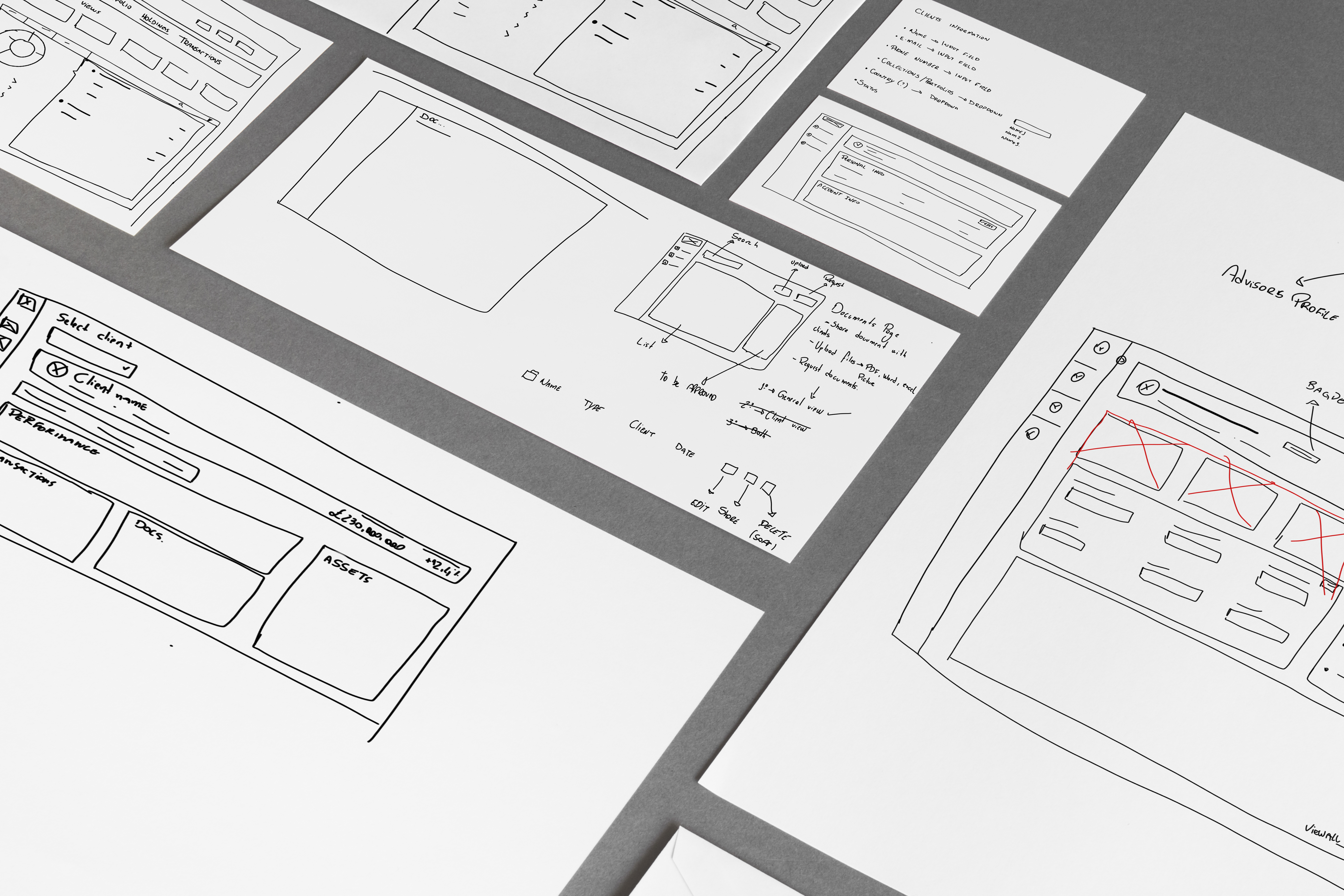
Where design choices had the most impact
Not every decision was visible. Many of the most important ones were structural or systematic — choices that shaped how every subsequent screen would behave.
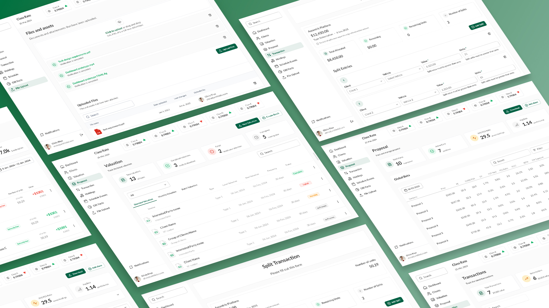
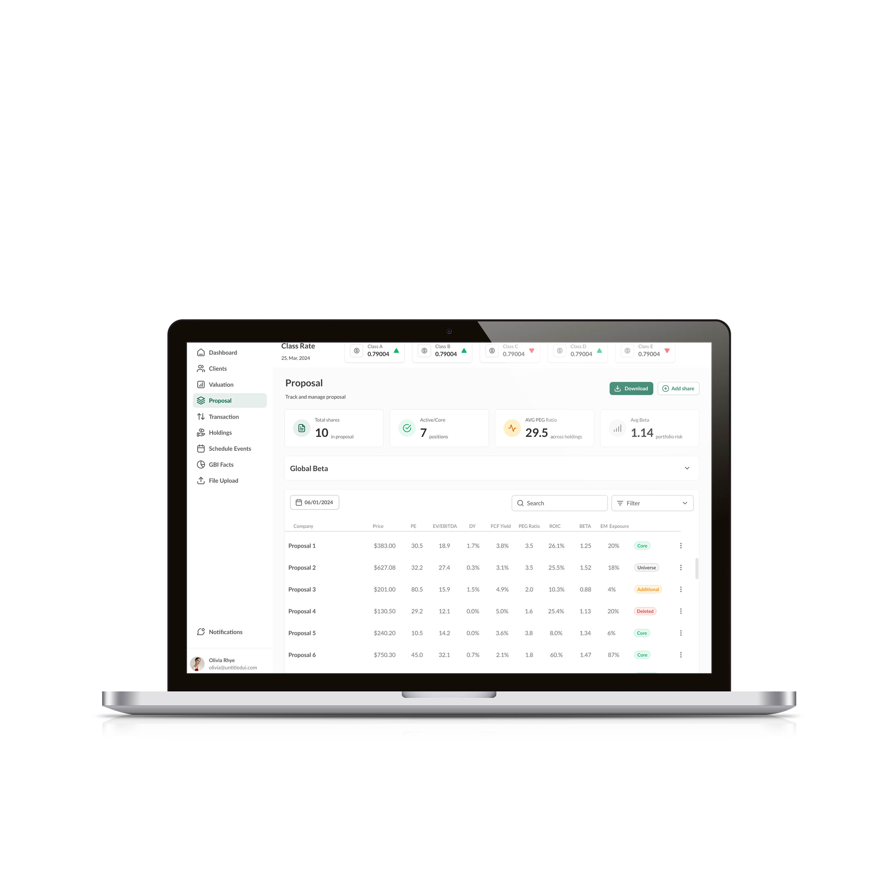
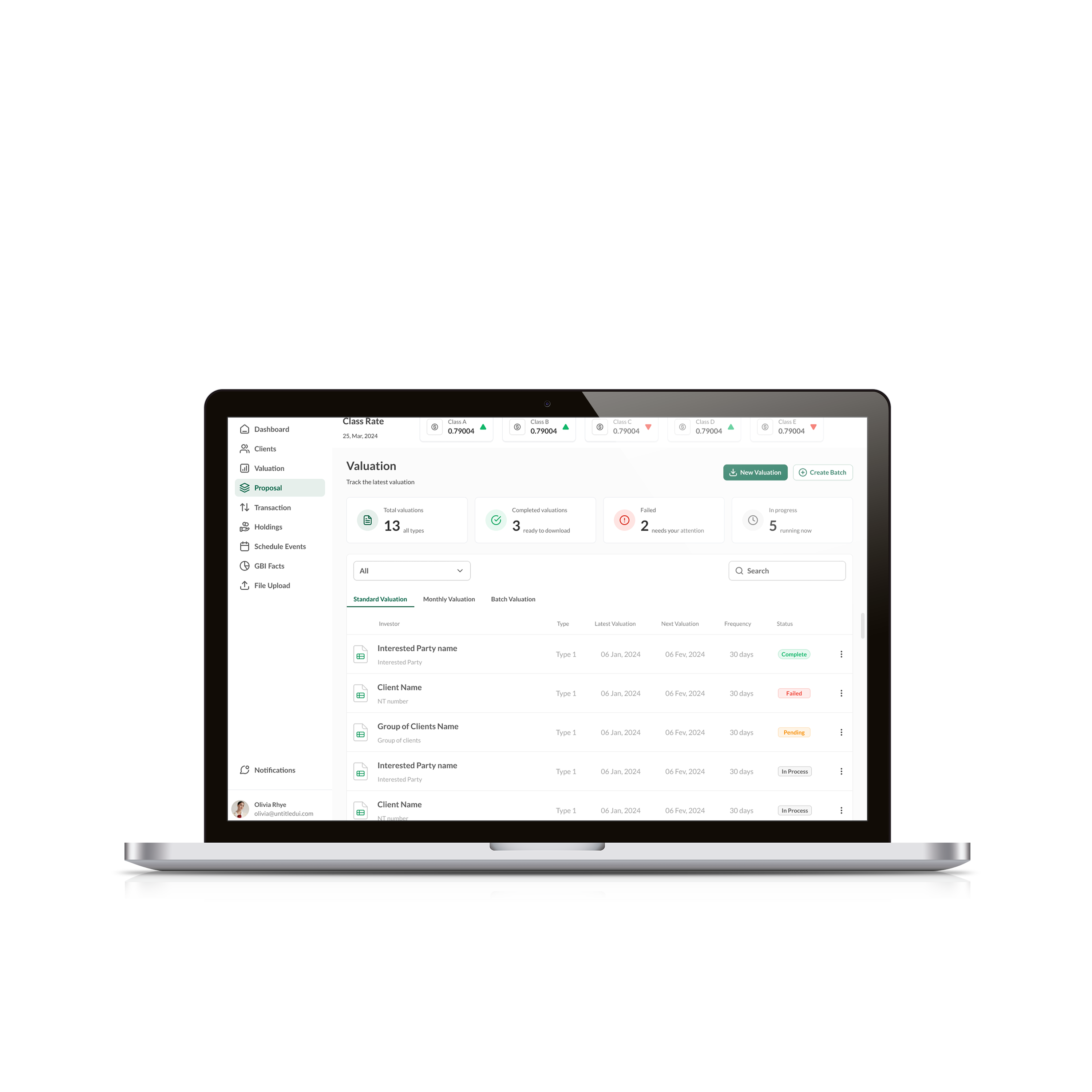
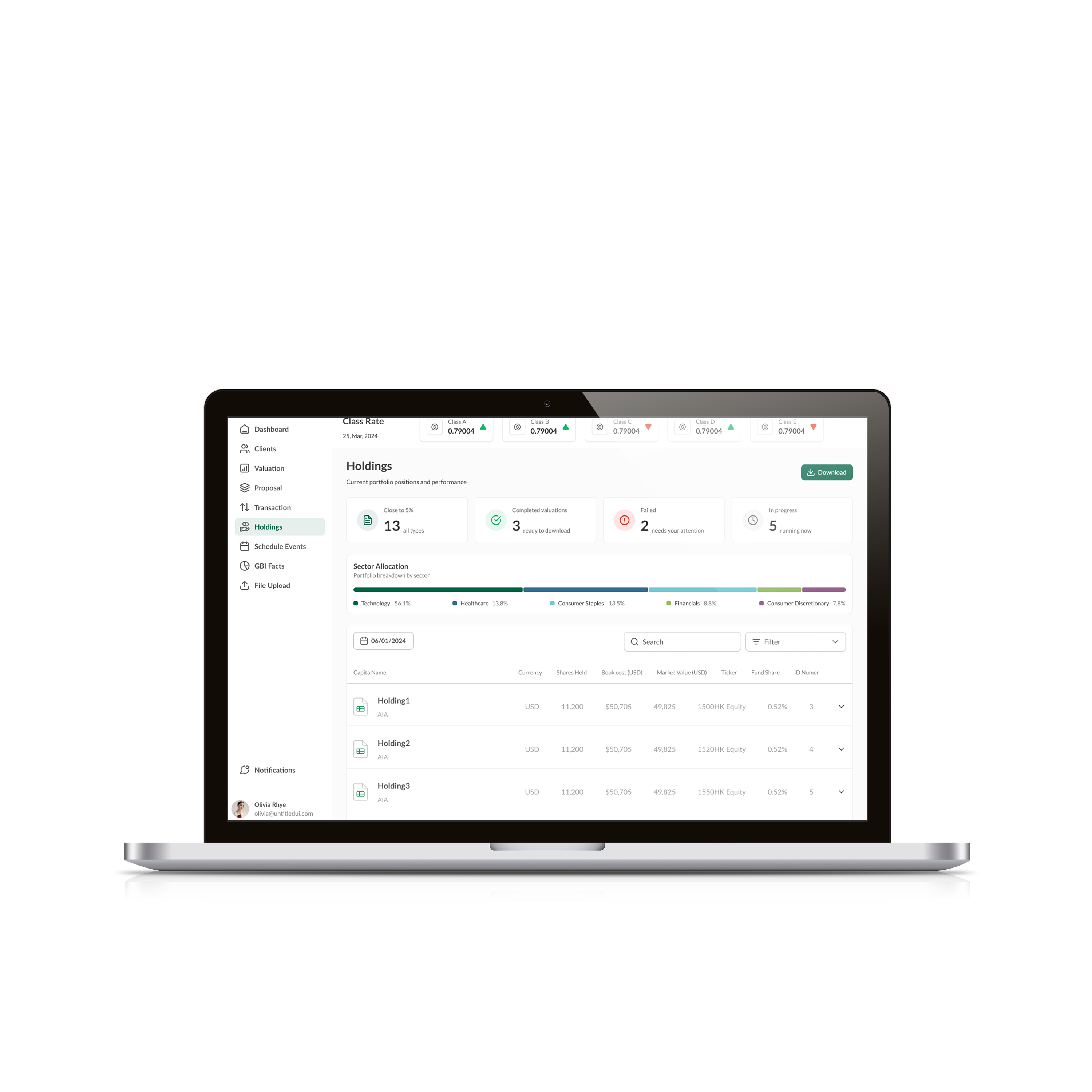
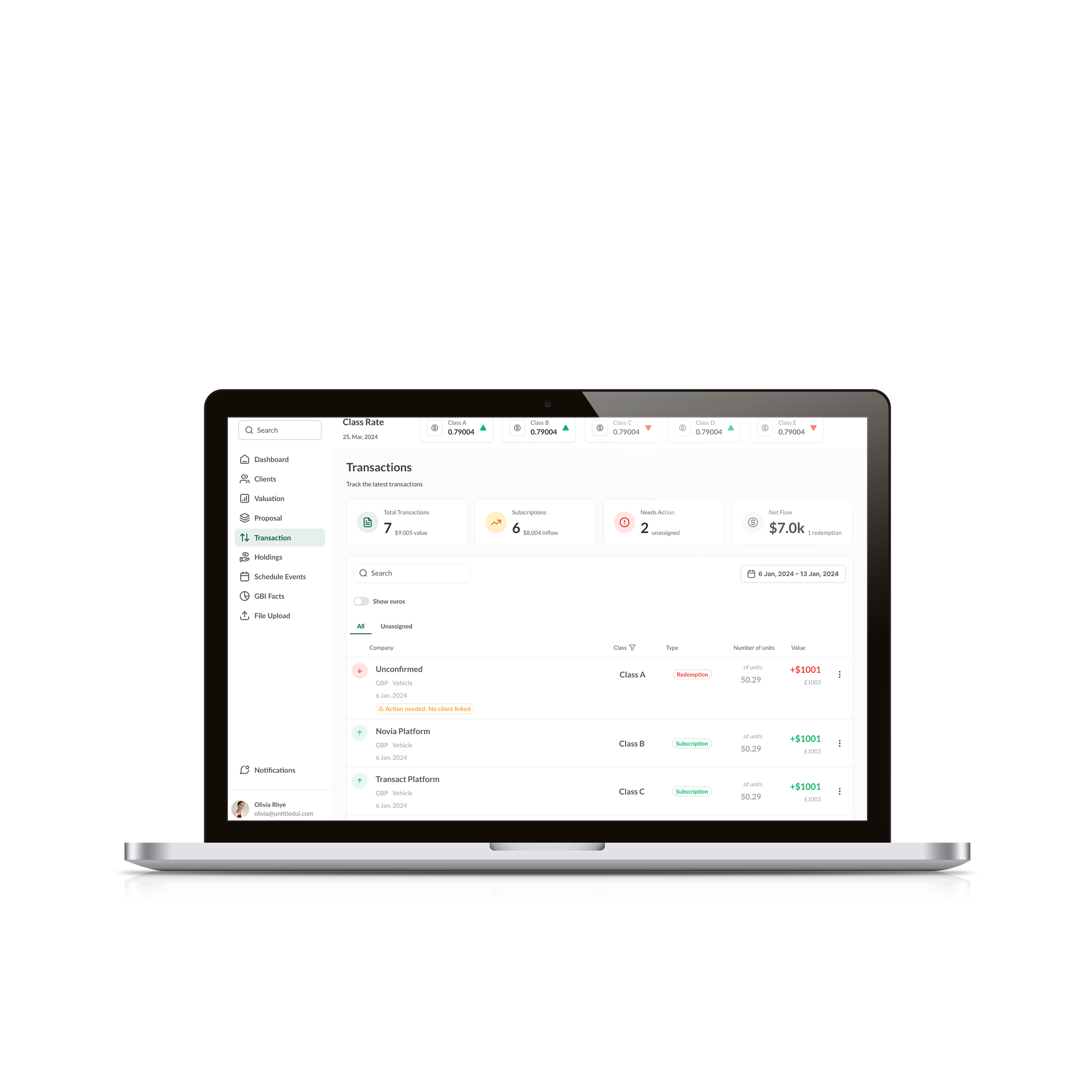
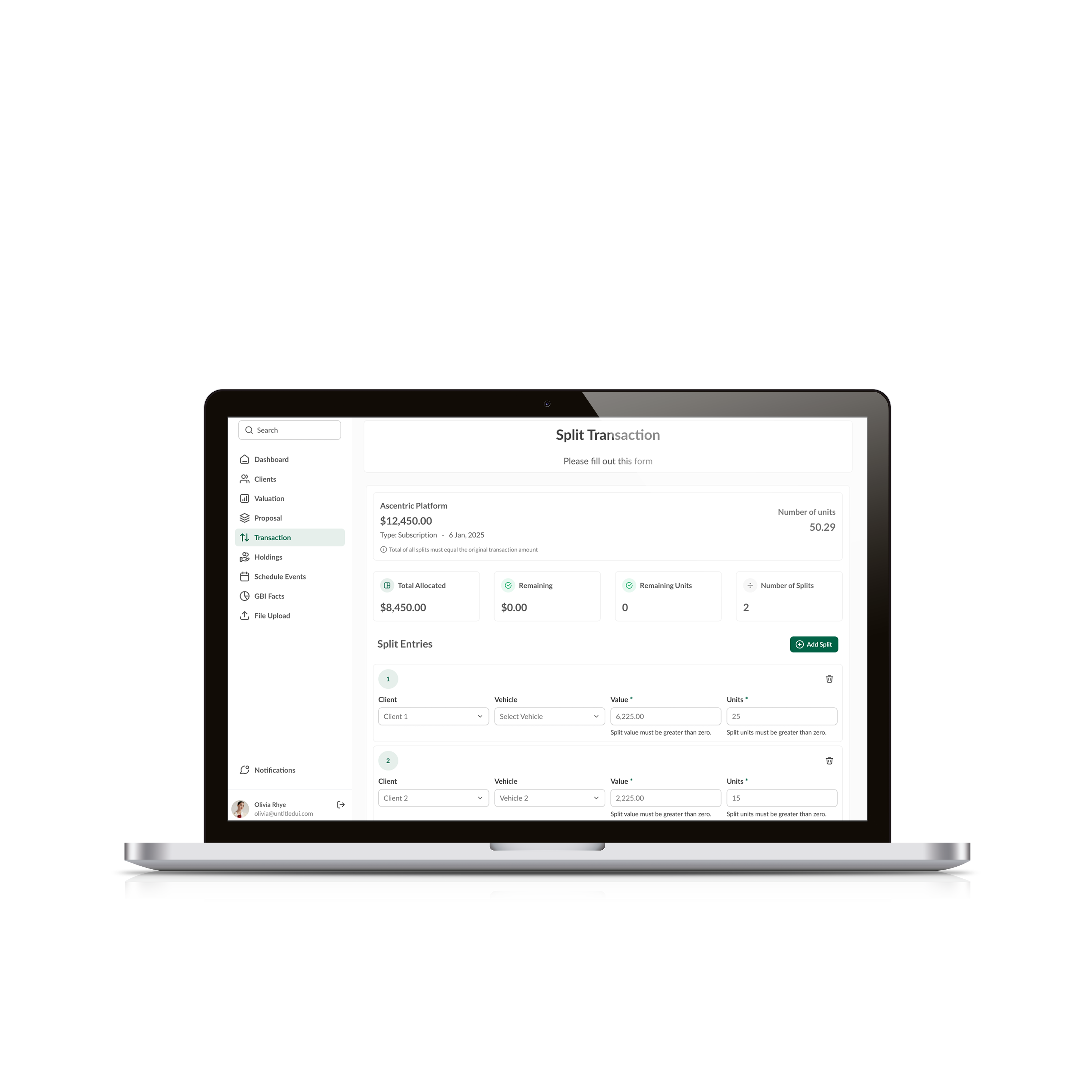
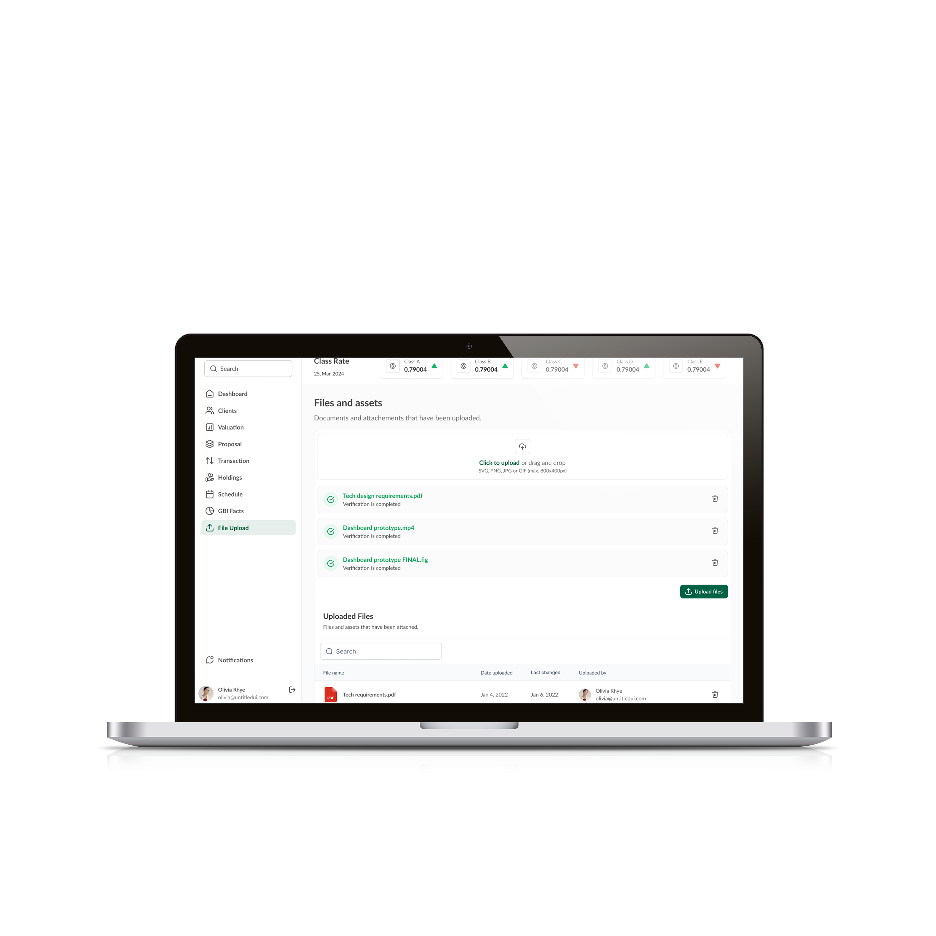
Selected views from the platform
Branding, client names, and data have been fully anonymised. Screenshots are for illustrative purposes only.
Structuring the path forward
Roadmap contribution was part of my remit. I helped the team think about not just what to build next, but in what order — and why.
- Navigation architecture
- Table component system
- Base form patterns
- Client & holdings views
- Confirmation patterns
- Advanced filter panels
- Bulk action handling
- Saved views & preferences
- Inline editing in tables
- Valuation workflows
- Report generation views
- Export formats (PDF, CSV)
- Proposal management
- Audit log access
- Cross-module summaries
- Workflow automation triggers
- Notification system
- Role-based permissions UI
- Onboarding flows
- Performance at scale
What the work produced
The results here aren't metrics — they're structural shifts that the team can feel.
What I'd do differently, and what I learned
Honest reflection matters more to me than a polished wrap-up.
- Visual hierarchy in data-dense interfaces requires more precision than in consumer products.
- Understanding the business logic behind the data is as important as designing how it's displayed.
- Embedding design culture in a team that hasn't had one takes patience, repetition, and demonstrated value.
- Consistency compounds — every well-designed pattern makes the next one easier to argue for.
- Earlier stakeholder alignment on navigation architecture would have saved rework in later phases.
- A more structured documentation approach from day one — not just Figma files — would have helped onboard new contributors faster.
- I'd invest more in usability testing earlier, even informal sessions, rather than relying solely on stakeholder feedback.
- Design tokens and a shared naming convention would have improved consistency in developer implementation.
- The roadmap moves into Phase 02 — advanced filtering, saved views, and deeper data control.
- Proposal management is the next major workflow to design end-to-end.
- A formal design system — not just a pattern library — is on the horizon as the team grows.
- Continued QA and iteration post-launch for the modules already shipped.