Back to Work
01 Heuristic Evaluation · Redesign Concept

Craigslist,
without the guesswork.

Craigslist has worked for decades because it is fast. It is also one of the hardest marketplaces for a newcomer to read. I audited the experience against Nielsen's heuristics, then redesigned one shopping journey: finding a desk, checking the listing and getting to know the seller. The aim was to remove the friction without throwing away the speed.

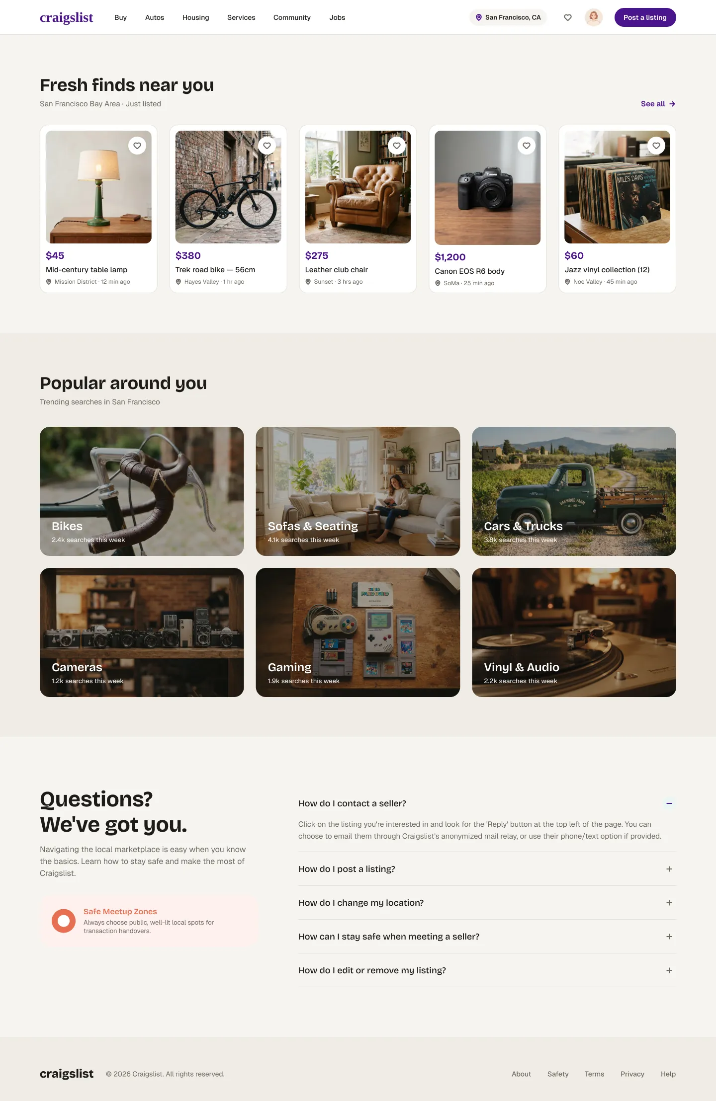
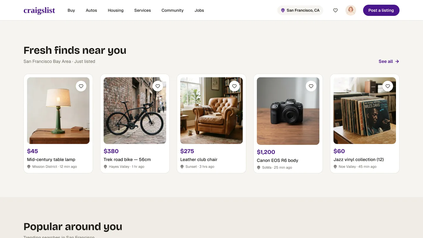
Redesigned Craigslist homepage: a simple top navigation with category menus, location and a Post a listing button, above a row of 'Fresh finds near you' listing cards with photos and prices.
02 The challenge

A marketplace that rewards people who already know it.

The homepage lists more than a hundred categories, all at the same visual weight. Someone who has used it for years scans it in seconds. A first-time buyer sees a wall of blue links.

Past the homepage, the problems are smaller but they add up. You open a map and can't find the way out. An icon could mean two different things. A filter label makes you stop and think. Every one of these moments makes the buyer less sure, just when they're deciding whether to trust a stranger.

New buyers need

A clear way in, visual cues about what matters, and an obvious way back when they take a wrong turn.

Power users need

Density, speed and familiar patterns. Any redesign that slows them down fails the people who already use it most.

Design question

How might we make finding, evaluating and contacting sellers about second-hand items more intuitive and trustworthy?

03 UX research & heuristic evaluation

An audit that looked for strengths as well as faults.

I reviewed the live site using Nielsen Norman Group's ten usability heuristics, rated each issue on the NN/g 0–4 severity scale, and looked at the visual design through three principles.

Hierarchy & scale

Do size, weight and layout lead the eye to the most important information first?

Contrast & colour

Do the things you can click stand out from static text? Craigslist's blue links are the test case.

Gestalt grouping

Are related functions and categories visibly grouped, or just placed next to each other?

Severity summary

NN/g scale · 0 none · 1 cosmetic · 2 minor · 3 major · 4 catastrophe
Missing map exit H3
Major · 3
Weak visual hierarchy H8
Minor · 2
Ambiguous icons H6
Minor · 2
Unclear terminology H2
Cosmetic · 1

The map that traps you

H3 · User control & freedom Major · 3
Observation
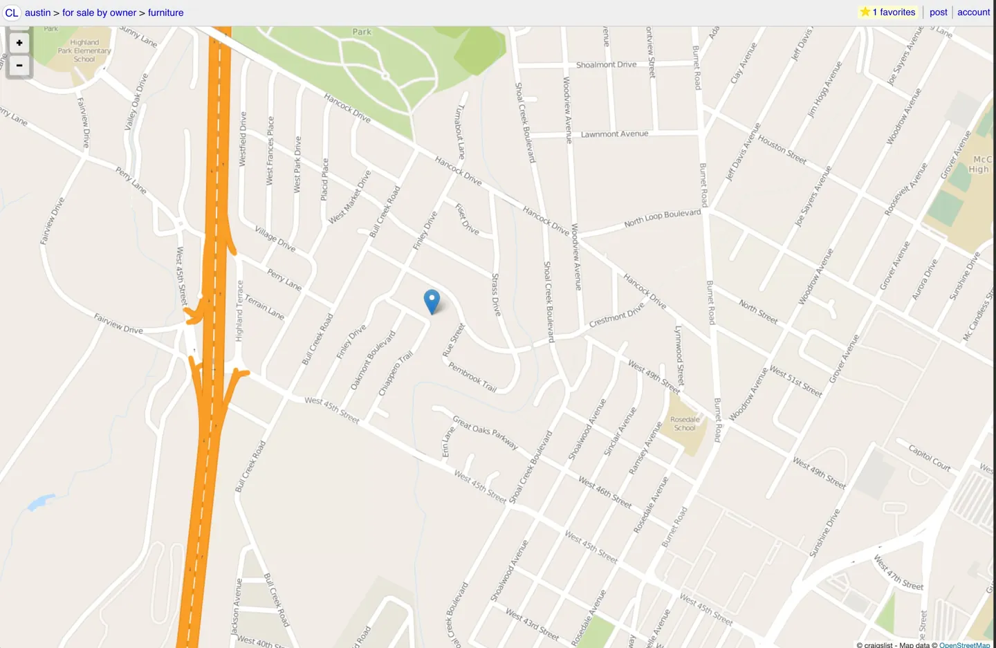
When you expand a listing's map, there's no clear control nearby to close it. The only way out is the browser's back button.
Why it matters
It breaks the usual pattern for modals and is worst on mobile. It was the only real blocker I found.
Original Craigslist full-screen map view of a furniture listing. Only zoom controls are visible, with no close or back button.
Original. Full-screen map: zoom controls, but no exit.

Everything shouts at the same volume

H8 · Aesthetic & minimalist design Minor · 2
Observation
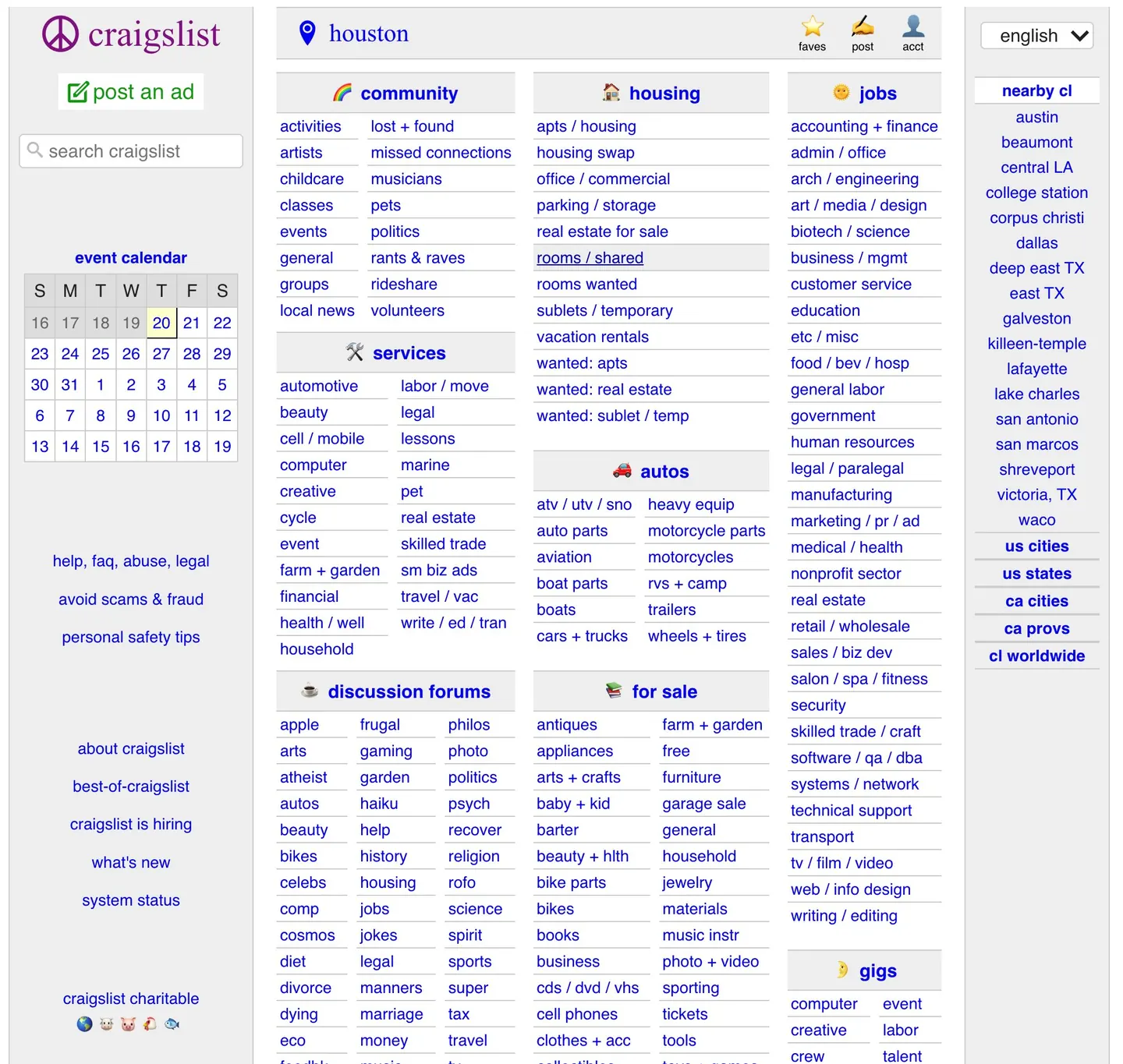
The homepage is a huge amount of text at almost the same visual weight. Categories have little proximity or containment to separate them, so nothing draws the eye.
Why only minor
The plain structure is exactly what lets veteran users scan quickly, or just use Ctrl+F. Rating this higher would have meant ignoring them.
Original Craigslist Houston homepage: a dense grid of blue text links grouped under community, housing, jobs, services, for sale and discussion forums, with an event calendar on the left.
Original. More than 100 links at the same visual weight.

An arrow that means something else

H6 · Recognition over recall H4 · Consistency Minor · 2
Observation
On a listing, a lone ▲ sits between "prev" and "next". On today's web an up arrow usually means "back to top", but here it means "back to search results".
Recommendation
Replace it with a text label that names where it goes.
Top of an original Craigslist listing page: breadcrumb, then prev, an up-arrow icon and next links above reply, favorite, flag and share actions.
Original. "prev ▲ next". The arrow doesn't say where it goes.

"Has image"

H2 · Match with the real world Cosmetic · 1
Observation
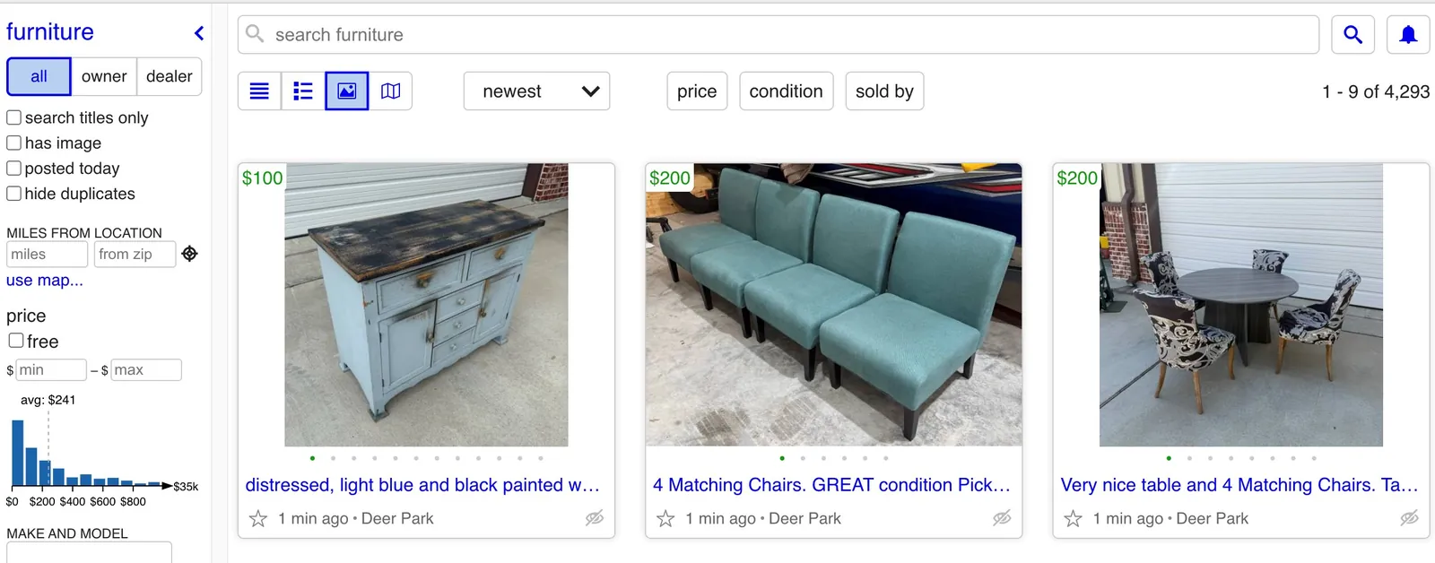
New users pause at this filter because they assume every listing has photos. People learn it quickly by trying it, which is why it's only cosmetic.
Recommendation
Spell it out, e.g. "Only show listings with images".
Original Craigslist furniture results: a left sidebar with checkboxes including 'has image', price inputs and a price histogram, next to a gallery of three listing photos.
Original. Furniture results with the "has image" checkbox at top left.

What's already working, and must survive the redesign

H8 · Strength

Focused listing pages

Once you're past the homepage, listings are calm and free of distractions. The photo, price and title stand out. The takeaway: refine the typography and spacing, but don't break the simplicity.

H4 · Strength

The "ugly" advantage

Blue underlined links and standard inputs have barely changed in decades. What users have learned never goes out of date. That reliability is worth protecting.

H7 · Strength

Built for power users

Dense pages let experienced users scan dozens of categories without hidden mega-menus or endless scroll. Any new hierarchy has to keep that speed.

04 From insights to design opportunities

Every change traces back to a finding, or is labelled as new.

Not everything in the audit made it into the redesign, and not everything in the redesign came from the audit. I've marked which is which.

ProblemUX insightDesign responseStatus
ProblemNo way out of the mapH3 · Major
InsightThe exit has to be visible where the user is, and tell them where it leads.
ResponseLocation becomes its own view with a labelled "Back to listing" that returns you to the same spot. It shows an approximate area to protect the seller's privacy.
Implemented
ProblemFlat homepageH8 · Minor
InsightNewcomers need somewhere to start. Experts need the full list one step away, not removed.
ResponseA homepage led by images ("Fresh finds", "Popular around you"). The full category list moves into grouped menus in the top navigation.
Implemented
ProblemAmbiguous ▲ iconH6 / H4 · Minor
InsightName the destination instead of drawing a symbol for it.
ResponseA breadcrumb (Home → Furniture → Desks) shows where you are, with text links back up the hierarchy.
Implemented
ProblemHard-to-read filteringGestalt recommendation
InsightGroup related controls and always show which filters are on.
ResponseFilters are grouped into clear sections (location, type, price, condition, seller). Active filters appear as removable chips with "Clear all".
Implemented
Problem"Has image" labelH2 · Cosmetic
InsightUse the buyer's words, not the system's.
ResponseNot addressed in this concept. The filter isn't in the new filter set yet. Next step: add "Only show listings with photos".
Future opportunity
ProblemLittle to go on about the sellerOutside the audit's scope
InsightThe question I set out with ends in "trustworthy". Buyers decide about the person as much as the item.
ResponseA seller card on every listing, a seller profile with reviews and other active listings, and safety tips at the moment of contact.
Beyond the audit

Why these, in this order

I prioritised by severity, then by where each issue sits on the desk journey. The map exit was the only Major rating, and it happens right before contact, the moment that matters most for the buyer.

What I chose not to fix

Density itself. The audit showed that much of what makes Craigslist look dated is also what makes it fast. So I didn't remove information. I moved it one step away, and kept text labels and standard controls everywhere.
05 User journey & wireframes

One realistic task: find a desk under $200, then contact the seller.

I mapped the steps before drawing any screens, so each wireframe had one clear job in the journey.

  1. 1
    Open Craigslist
    Arrive with a goal, not a category.
    Homepage
  2. 2
    Select Furniture
    From the Buy menu, not a wall of links.
    Navigation
  3. 3
    Search "office desk"
    Search is scoped to the category.
    Results
  4. 4
    Filter: max $200
    Applied filters stay visible.
    Results
  5. 5
    Select one desk
    The decision point.
    Listing
  6. 6
    Review photos & details
    Plus location and who's selling.
    Listing · Seller
  7. 7
    Contact seller
    Email or phone, chosen in one step.
    Contact
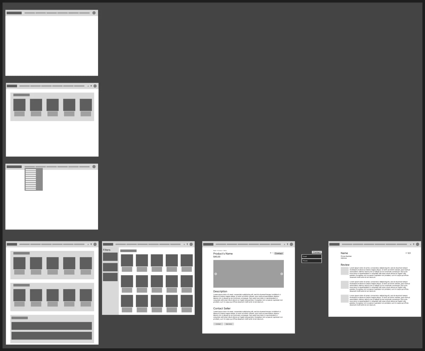
Low-fidelity grey wireframes: homepage variations with a category dropdown and image rows, a furniture results grid with a filter sidebar, a listing page with gallery, description and contact options, and a seller page with reviews.

Structure before style

The wireframes tested three ideas early. Could categories live in a dropdown instead of on the page? Could image rows give newcomers an entry point? And could the seller get a page of their own?

On the listing wireframe, "Contact" sits next to the title and repeats under the description, so the main action is always in reach. The contact control opens to a choice of email or phone.

06 The redesigned experience

Same marketplace. Clearer signals at every step.

Each screen is shown next to the original, with the finding it answers.

Homepage & navigation

A way in for newcomers, without hiding anything from experts.

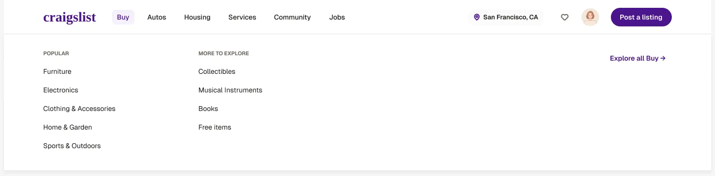
The homepage now starts with real listings and popular searches. The full category list moved into the top navigation, grouped the way buyers already think: Buy, Autos, Housing, Services, Community, Jobs.

The Buy menu open in the redesigned navigation, listing Popular categories (Furniture, Electronics, Clothing and Accessories, Home and Garden, Sports and Outdoors) and More to explore.
Buy menu. Categories are one hover away and grouped into "Popular" and "More to explore".
Addresses H8 · hierarchy

One entry point per section

Large headings and photo cards give the eye a place to start. The old page offered over a hundred equal options.

Gestalt · grouping

Categories grouped, not deleted

The dense list survives inside menus, so experienced users still reach any category in one step.

Keeps H4 · consistency

Plain text labels everywhere

Navigation uses words, not icons. That's in line with the audit's advice to translate icons into text.

Search & filtering

Filters you can see, read and undo.

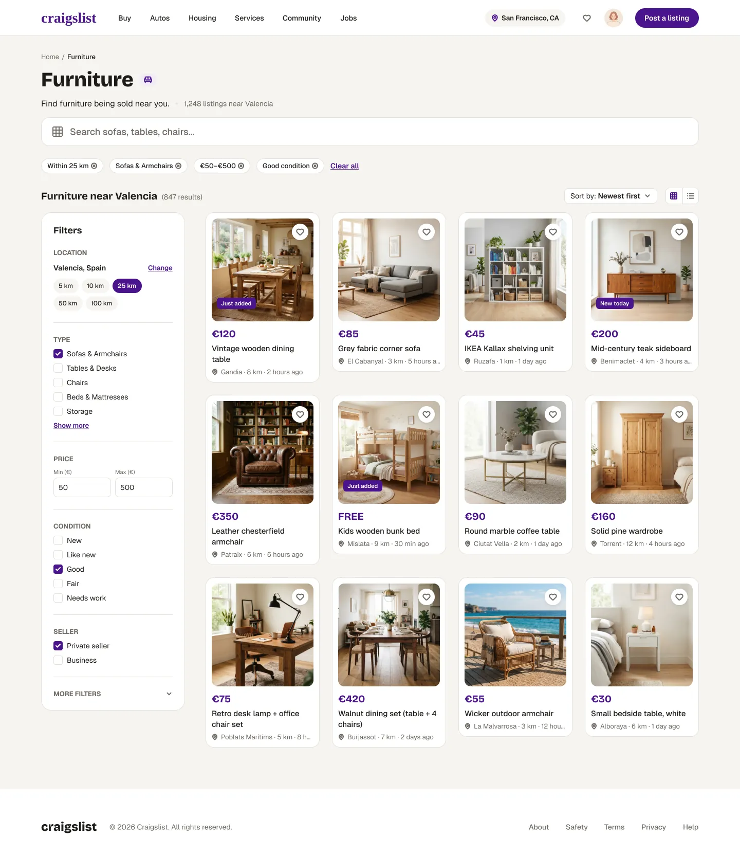
In the original, filters are a long list of checkboxes and empty fields, and it's hard to tell which ones are on. The redesign groups them into labelled sections and repeats every active filter as a chip above the results.

H1 · visibility of status

Active filters as chips

"Within 25 km", "€50–€500", "Good condition". Each can be removed on its own, or all at once with "Clear all".

Gestalt · grouping

A panel with clear sections

Location, Type, Price, Condition and Seller each get a heading and a divider. The rarely used options sit under "More filters".

H3 · user control

Search scoped to the category

"Search sofas, tables, chairs…" tells you what you can search, and a breadcrumb shows how you got here.

Product details

Keep the calm, then add what buyers need to decide.

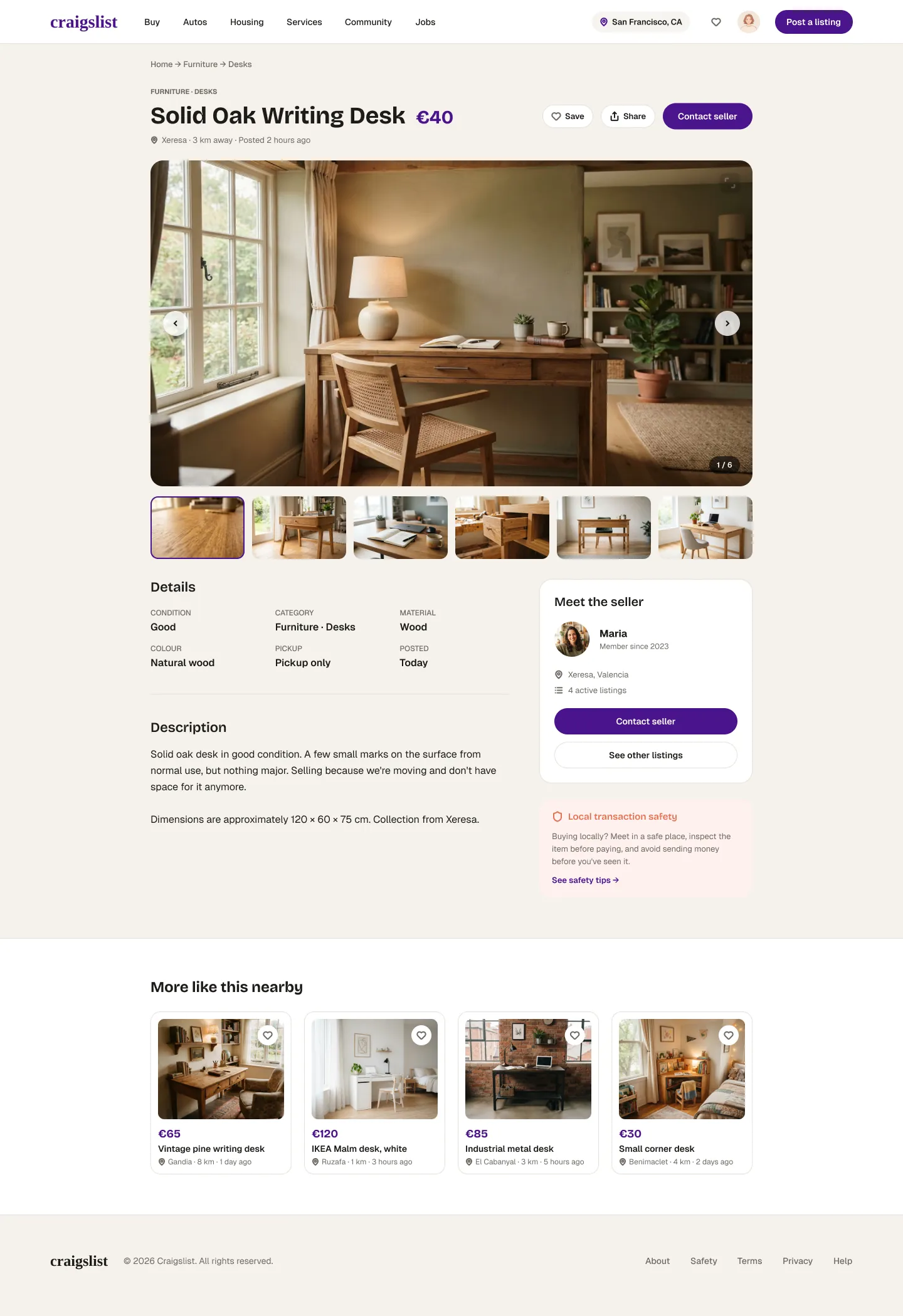
The audit called the original listing page a strength, so I kept its layout: photo first, title and price clear. What changed is how you get around it, a structured set of details, and the seller made visible.

Before · listing navigation
Original listing header with prev, an up-arrow icon, and next.
After · listing navigation
Redesigned listing header with a Home, Furniture, Desks breadcrumb, the title Solid Oak Writing Desk at €40, and Save, Share and Contact seller buttons.
Full redesigned listing page for a Solid Oak Writing Desk: breadcrumb, title and price, large photo gallery with thumbnails, a details grid, description, a Meet the seller card with Contact seller and See other listings buttons, a local transaction safety note and More like this nearby.
  1. Breadcrumb replaces ▲

    "Home → Furniture → Desks" names every level, so there's no symbol to decode.

    H6 · H4
  2. One primary action

    "Contact seller" is the only filled button. Save and Share are secondary.

    Hierarchy
  3. Gallery with position

    Arrows, thumbnails and a "1 / 6" counter. You always know how many photos are left.

    H1 · status
  4. Details as a scannable grid

    Condition, material, colour and pickup are pulled out of the free-text description.

    H8 · Gestalt
  5. Meet the seller

    Name, member since, area and number of active listings. Context before you reach out.

    Beyond the audit · trust
  6. Safety at the moment it matters

    Local pickup advice sits next to the contact action, not on a separate help page.

    Beyond the audit · trust
Listing location · the Major issue

A map you can always leave.

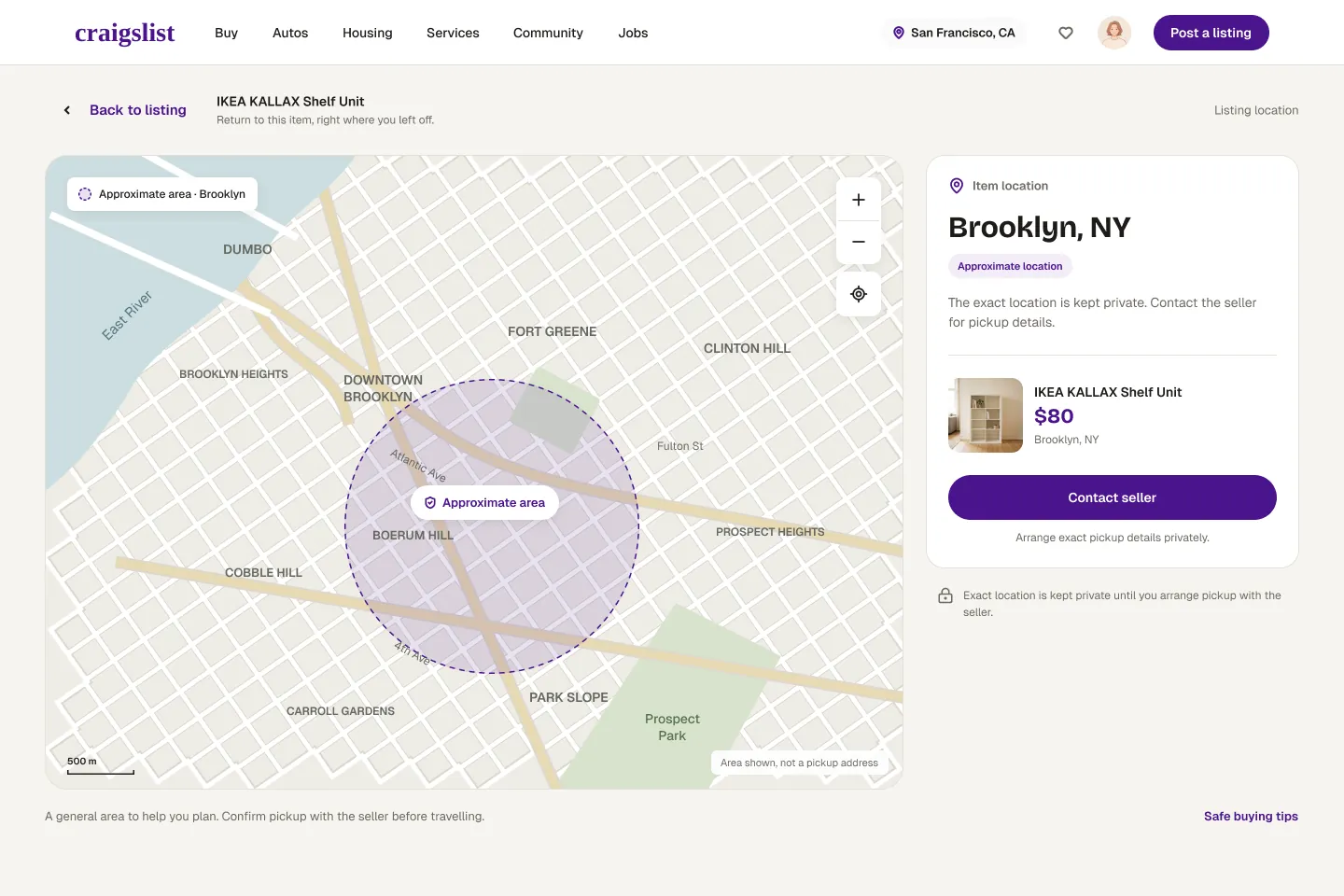
This fixes the only Major finding. Location is now a dedicated view. A labelled "Back to listing" sits at the top left, with the item's name beside it, and it returns you to the same place on the listing.

Addresses H3 · Major

A labelled exit

"Back to listing" plus the item name. It says where you'll go, not just that you'll leave.

H3 · user control

Position preserved

Going back returns you to the same spot on the listing, so the detour costs nothing.

Beyond the audit · trust

Approximate area, by design

A dashed radius, labelled "not a pickup address", protects the seller and sets honest expectations.

Seller profile & active listings

Evaluating the person, not just the product.

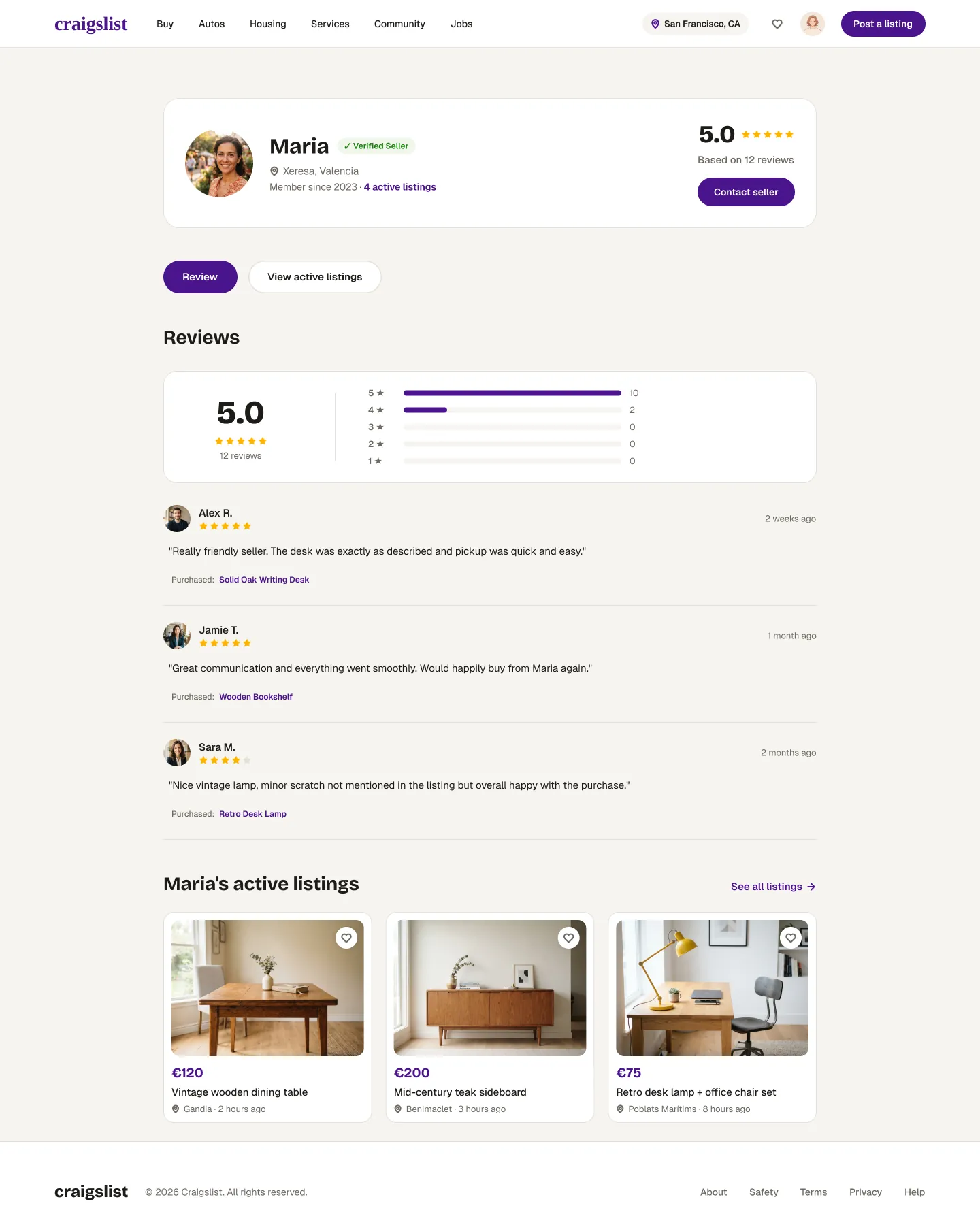
The original has no seller page to compare against, so this part is new. It answers the "trustworthy" half of the design question: who is this, what have others said, and what else do they sell?

Redesigned seller profile for Maria: verified seller badge, location, member since 2023, 5.0 rating from 12 reviews, Contact seller button, a rating breakdown, written reviews tied to purchased items, and a row of Maria's active listings.
  1. Identity at a glance

    Photo, area, member since and a verification badge, with the contact action kept in the same card.

  2. Reviews tied to items

    Each review names what was bought ("Purchased: Solid Oak Writing Desk"), so feedback reads as evidence.

  3. Honest, mixed signals

    A 4-star review mentioning an unlisted scratch is shown alongside the 5-star ones. The breakdown shows the full spread of ratings.

  4. Active listings

    Other items from the same seller turn one purchase into a reason to keep browsing.

07 Outcomes & reflection

A concept with clear hypotheses, ready to be tested.

This hasn't been tested with users yet, so there are no results to report. Here's what the redesign is meant to improve, and how I'd check it.

Aims to improve

Fewer dead ends, faster decisions

  • No getting stuck in the map view
  • Newcomers find the right category faster
  • Fewer moments where buyers stop to decode an icon or label
  • More confidence before contacting a seller
To validate

Moderated usability test

  • Task: "Find a desk under $200 and contact the seller", on the original and the prototype
  • Measure task success, time on task and wrong turns
  • Recruit both first-time and long-time users. The redesign must not slow the experts down
  • Ask what makes a seller feel trustworthy
Next iteration

Open opportunities

  • Rename "has image" to plain language (H2)
  • Test whether the homepage needs a global search bar
  • Design the mobile flow, where the map trap hurts most
  • Make location, currency and sample content consistent across all screens
The most useful finding wasn't a problem. It was learning which "flaws" users actually depend on.

A heuristic audit can easily turn into a list of everything that looks old. Rating severity forced me to ask who each issue really hurts. That's why the dense homepage got a Minor and not a Major, and why the redesign moves information instead of removing it.

If I did it again, I'd run a short test on the original site before redesigning, so the severity ratings rested on observed behaviour as well as expert judgement.

Explore more work
Back to all projects