Back to Work
UX/UI Design · Postgraduate Project

Cora Saúde

Helping self-employed healthcare professionals manage clients, appointments, and finances — all in one place.

01 · Overview

Bridging finance and patient care

Cora is a Brazilian digital bank that provides free business accounts for micro and small entrepreneurs. For my postgraduate degree in UI/UX Design and Digital Products, I chose to tackle a challenge set by Cora: designing a solution to help self-employed healthcare professionals manage their businesses more effectively.

The project followed a full end-to-end UX process — from desk research and user interviews through to ideation, wireframing, and UI design — over the course of several months.

02 · The Challenge

How can we help self-employed healthcare professionals manage clients and appointments in a professional way?

Self-employed healthcare professionals in Brazil face a daily balancing act between delivering patient care and managing the administrative and financial side of their businesses. Most lack dedicated tools — relying on WhatsApp groups, paper notebooks, and spreadsheets to track clients, appointments, and payments. This fragmentation creates friction, lost revenue, and emotional stress around money management.

I lose the courage to charge — it feels like I am going to ruin the relationship with my patient.
25.6M
Self-employed workers in Brazil
6.2M
Healthcare professionals in Brazil
67%
Spend 4+ hours weekly on admin tasks
70%
Still do manual financial control
03 · Design Process

Double Diamond approach

A structured end-to-end process moving from broad exploration to focused delivery — diverging to understand the problem space, then converging to build the right solution.

Step 01
Discover
Desk research, competitive analysis, and immersion into the healthcare professional's daily reality in Brazil.
Step 02
Define
User interviews, online survey synthesis, affinity mapping, persona creation, and problem statement definition.
Step 03
Ideate
Feature brainstorming, jobs-to-be-done mapping, solution sketching, and prioritisation on the effort–impact matrix.
Step 04
Design
Information architecture, user flows, wireframes, design system, and high-fidelity UI screens in Figma.
Step 05
Validate
Prototype testing, usability sessions, iteration based on user feedback, and final documentation.
04 · Research

Understanding before designing

Research was the foundation. Before touching any screens, I needed to understand the real behaviours, frustrations, and mental models of self-employed healthcare professionals.

Desk Research
Secondary research into the Brazilian healthcare market, self-employment statistics, existing fintech solutions, and behavioural patterns around money management. Established the scale of the problem and the competitive landscape.
User Interviews
8 in-depth qualitative interviews with self-employed healthcare professionals including nutritionists, physiotherapists, and psychologists. Explored their daily admin workflows, financial pain points, and attitudes towards technology.
Online Survey
A 10-day Google Forms survey distributed within healthcare professional communities. Gathered quantitative data on tool usage, time spent on admin, financial management habits, and openness to digital solutions from a broader sample.
05 · Competitive Analysis

Where Cora stands in the market

Analysing direct and adjacent competitors revealed a clear gap: no single tool combined the financial trust of a digital bank with the scheduling and client management needs of healthcare professionals.

Feature Cora Asaas
Free PJ Account Yes Partial
Automated Billing Yes Yes
Payment Reminders Partial Yes
Client Database No Partial
Appointment Scheduling No No
Mobile UX Yes Partial
06 · Key Insights

What the research revealed

Four patterns emerged consistently across all research methods — each pointing to a different dimension of the same core problem.

Fragmented Tools
Professionals were juggling 4–6 different tools simultaneously — WhatsApp for scheduling, notes apps for client records, spreadsheets for finances, and physical calendars for appointments. Context-switching was constant and exhausting.
Emotional Pain in Billing
Charging patients felt deeply uncomfortable. Professionals feared damaging the therapeutic relationship, leading to delayed invoices, forgotten payments, and significant revenue loss. The emotional barrier was bigger than the logistical one.
Trust in Known Brands
Participants were significantly more willing to adopt a new feature from a brand they already trusted — particularly their banking app — than to download an entirely new app. Cora's existing relationship was a key differentiator.
Admin Overload
Administrative tasks — scheduling, chasing payments, updating records — were consuming more than 4 hours per week for the majority of interviewees. Time that could be spent with patients or on professional development was lost to admin.
07 · Persona

Designing for Ana

Synthesised from 8 interviews and survey data, Ana represents the primary user: a self-employed healthcare professional managing her practice solo.

Ana Ribeiro
Nutritionist · 32 · São Paulo, Brazil
Background

Ana has been practising as a self-employed nutritionist for 4 years. She sees 15–20 patients per week from a shared clinic space. She uses WhatsApp, a paper diary, and a personal spreadsheet to run her entire practice. She loves her work but dreads Monday mornings — spent catching up on payment chasers and updating client records.

Pain Points
  • Loses track of who has and hasn't paid each month
  • Feels awkward sending payment reminders to patients
  • Struggles to find client history across multiple apps
  • Wastes time rescheduling via WhatsApp back-and-forth
  • No clear view of monthly income vs. expected income
Needs
  • One place to see all clients and their appointment history
  • Automatic payment reminders that feel professional, not cold
  • Simple financial dashboard to track monthly earnings
  • Easy appointment scheduling without phone calls
  • Trust that her financial data is secure and accessible
I just want to focus on my patients — not spend half my day chasing payments and updating spreadsheets.
08 · Ideation

From insights to features

After mapping jobs-to-be-done and running a prioritisation exercise, four core features emerged as the highest-impact, most viable solutions to Ana's core frustrations.

Integrated Calendar
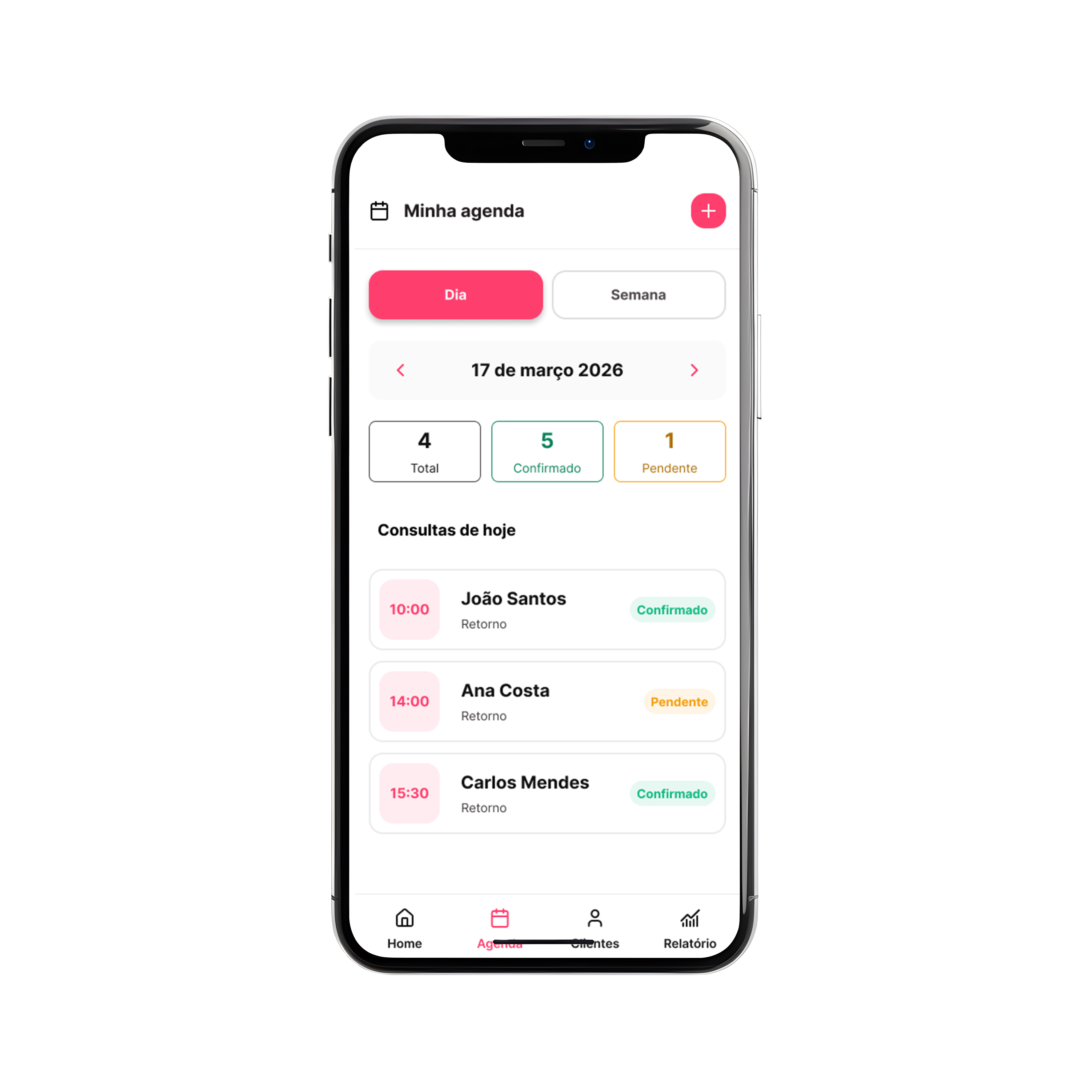
A weekly/monthly view of all appointments synced with client records. Allows scheduling, rescheduling, and cancellation directly from the app — eliminating WhatsApp back-and-forths. Sends automatic confirmations to patients.
Client Management
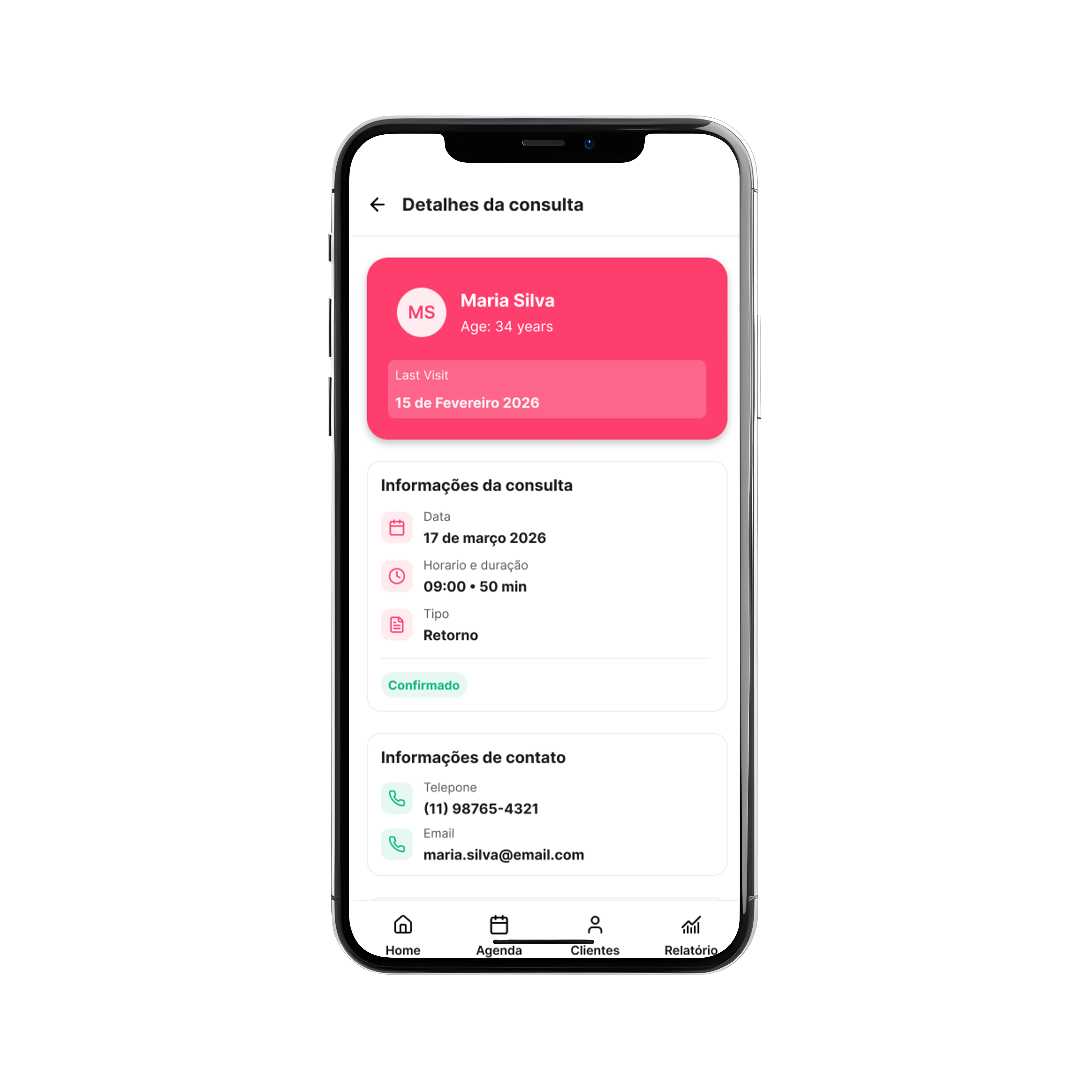
A unified client database linking each patient to their full appointment history, payment records, and notes. Replaces fragmented spreadsheets and physical records with a single, searchable source of truth.
Empathetic Reminders
Automated payment reminders sent via WhatsApp or SMS with a warm, professional tone. Templates designed to remove the emotional burden of chasing payments — the reminder happens automatically, maintaining the care relationship.
Daily Dashboard
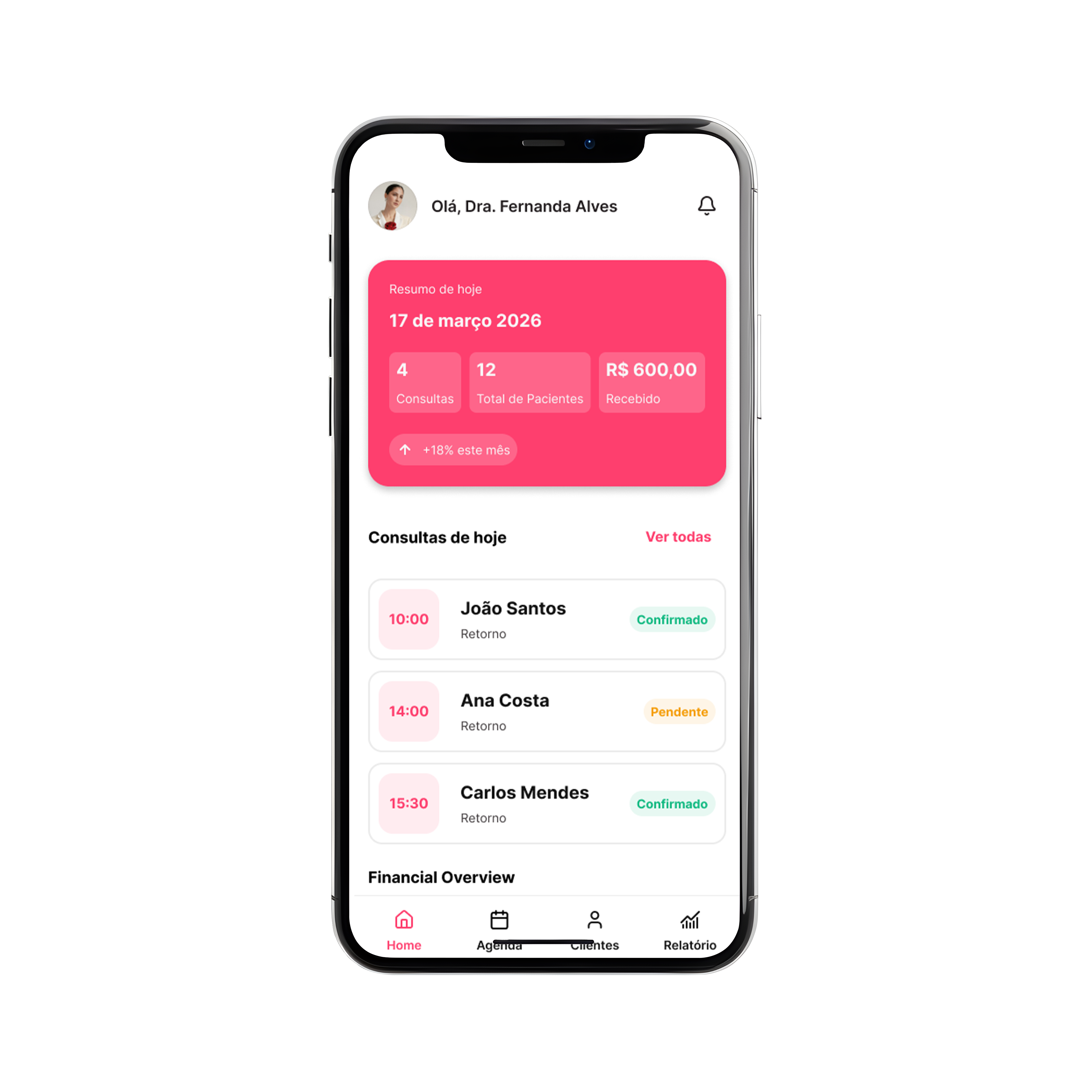
A financial overview showing today's appointments, pending payments, monthly income vs. target, and upcoming reminders. Designed to give Ana a clear, confident view of her business without needing to open multiple apps.
09 · Wireframes & UI Design

From flows to screens

User flows and low-fidelity wireframes were validated before moving to high-fidelity design in Figma.
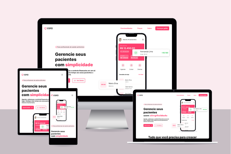
Cora Saúde — multi-device mockup
App Mockups
Cora — Home screen mockup
Cora — Agenda screen mockup
Cora — Appointment details mockup
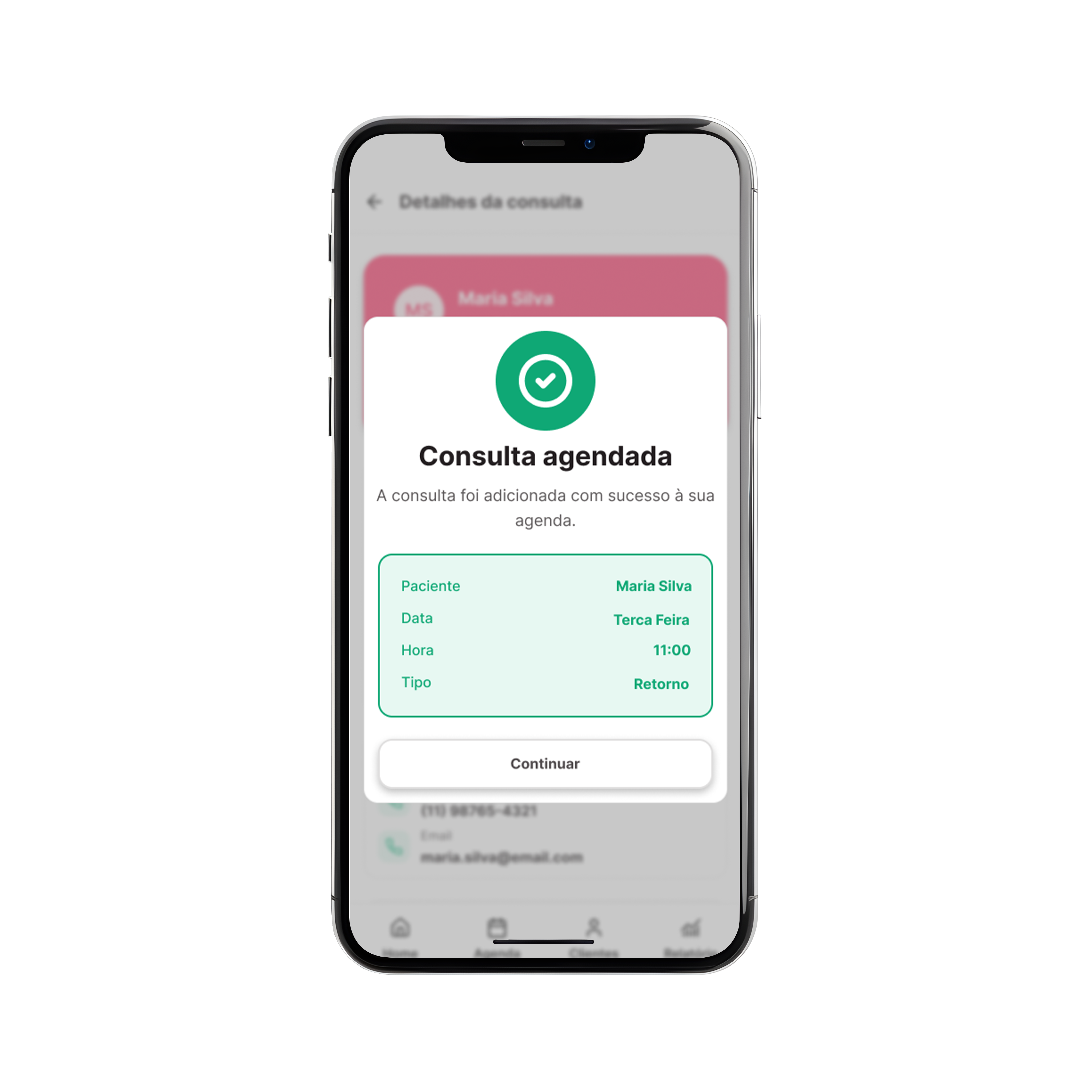
Cora — Modal mockup
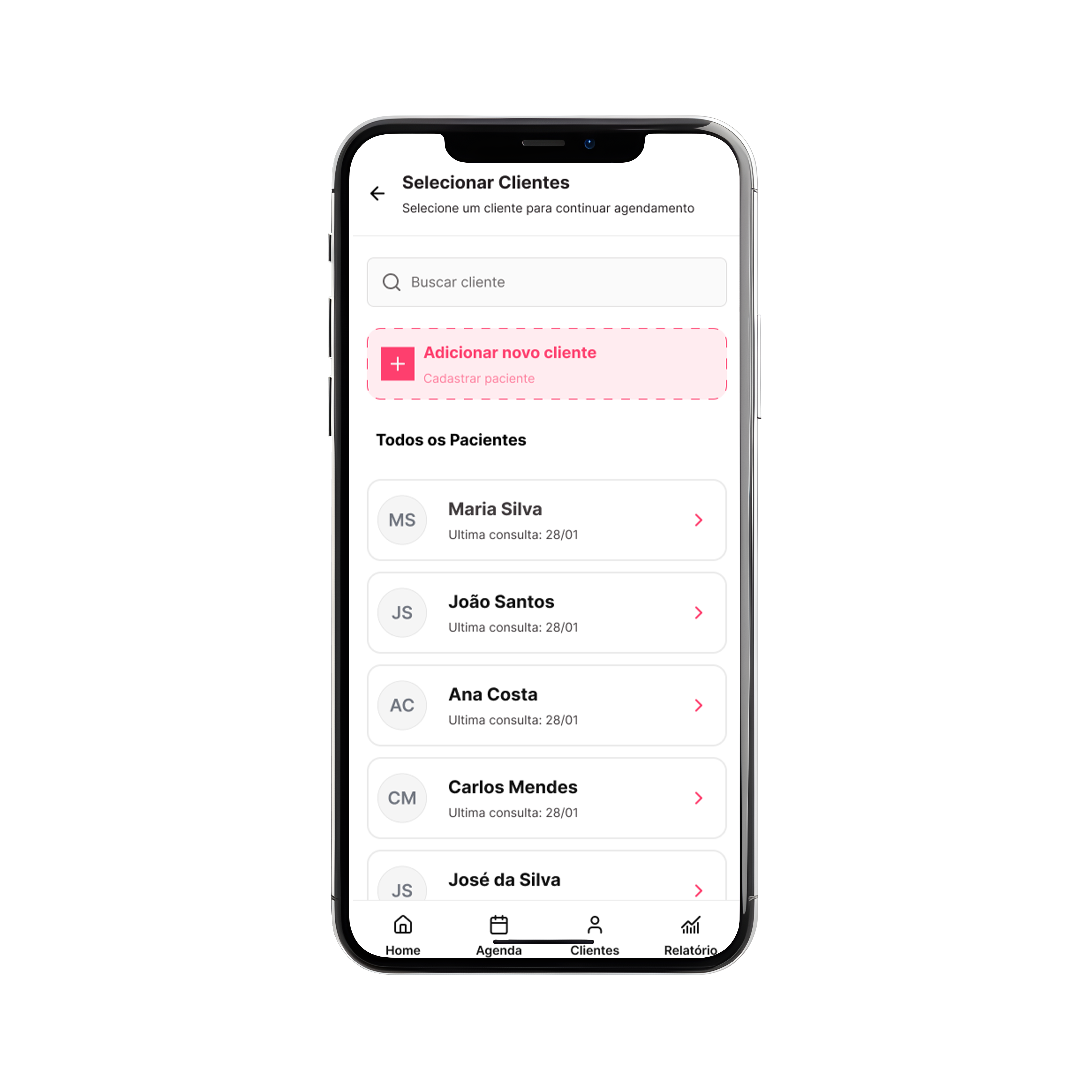
Cora — Select clients mockup
10 · Design System

Building a consistent foundation

A component library and token system were established to ensure consistency across all screens and enable scalable design decisions.

Cora Design System — full overview
11 · Outcomes

What the project produced

Three concrete deliverables came out of this project — each grounded in research and built for a real user need.

Research
A validated research foundation: 8 user interviews, an online survey, competitive analysis, and synthesised insights — all documented and traceable back to design decisions.
Design System
A structured component library covering colour tokens, typography, spacing, and interactive states — ensuring the UI is consistent, accessible, and scalable across the full product.
Prototype
A high-fidelity interactive prototype in Figma covering the four core features — Calendar, Client Management, Empathetic Reminders, and Daily Dashboard — ready for usability testing.
12 · Reflections

What this project taught me

Working through a full UX process from scratch — with real users, real constraints, and a real brief — produced lessons that go beyond the deliverables.

Learning 01
Empathy is a design tool
The most powerful insight in this project wasn't a data point — it was a quote about the fear of charging patients. Understanding the emotional context behind a behaviour reshaped the entire approach to how reminders and billing should feel. Empathy isn't soft; it's structural.
Learning 02
Research prevents assumptions
Before user interviews, I assumed the main problem was a lack of scheduling tools. After interviews, it was clear the deeper pain was around payment anxiety and fragmented client information. Research doesn't just validate ideas — it replaces them with better ones.
Learning 03
Brand trust is a feature
Interviewees were far more open to adopting a new feature within Cora's existing app than a standalone competitor. Trust — built over time through financial reliability — is a UX asset. Designing within a trusted brand context changes the adoption equation fundamentally.
Learning 04
Documentation drives clarity
Using Obsidian for structured research notes throughout the project meant that every design decision had a traceable origin. Good documentation isn't bureaucracy — it's the difference between a portfolio piece that tells a story and one that just shows screens.
Explore more work
Back to all work