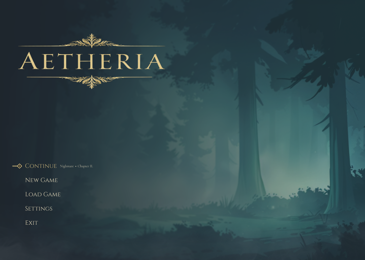
Main Menu
The entry screen establishes tone immediately through atmospheric lighting, restrained ornament, and a clear primary action path. The composition was designed to feel cinematic without sacrificing legibility.
A self-initiated interface study exploring how a fantasy RPG could feel elegant, atmospheric, and responsive. The project combines UI design, visual systems, and motion thinking to create a polished character-driven experience.
Designing a fantasy UI that feels atmospheric without losing clarity.
Aetheria started as a UI exploration into how a fantasy RPG interface could feel premium, immersive, and system-driven at the same time. The goal was to balance mood and usability, building a visual language that supports menus, class selection, and motion-led feedback without becoming visually heavy.
The Problem
Fantasy interfaces often lean too far in one direction: overly ornamental and hard to read, or extremely functional but disconnected from the game world. Aetheria explores how to hold atmosphere and clarity in the same system.
The Approach
I built the project like a small design system — defining a controlled palette, typography hierarchy, reusable decorative motifs, and a component language that could scale across onboarding, menu states, and class-specific panels.
Motion Thinking
Even as static UI, the system was designed with animation in mind — hover states, class transitions, stat animations, light pulses, and atmospheric background changes were considered part of the interface language from the start.
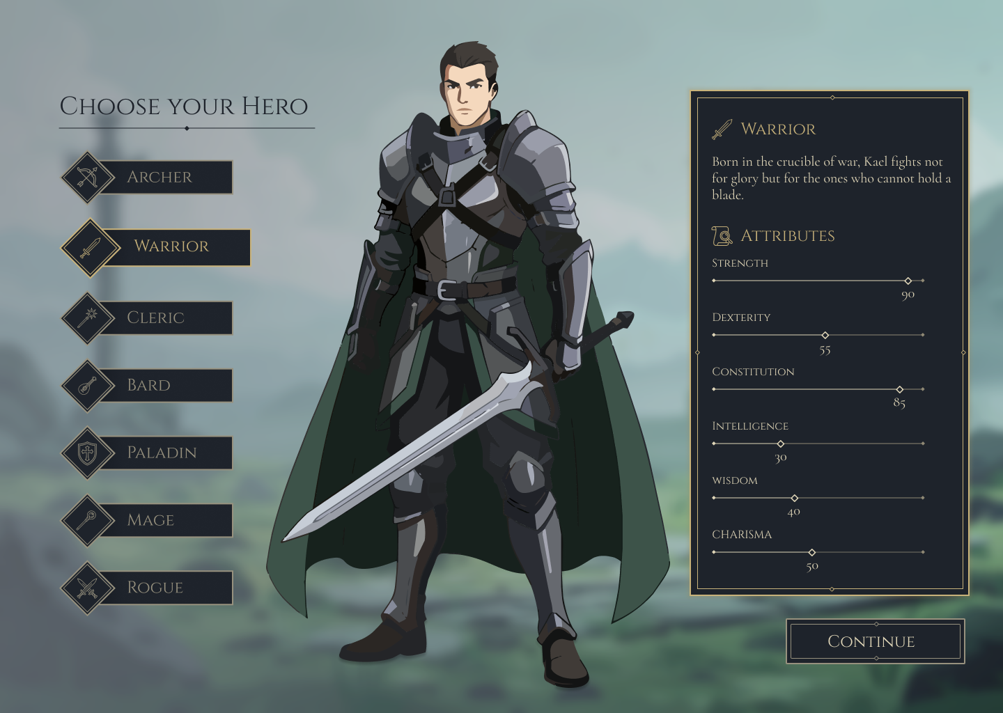
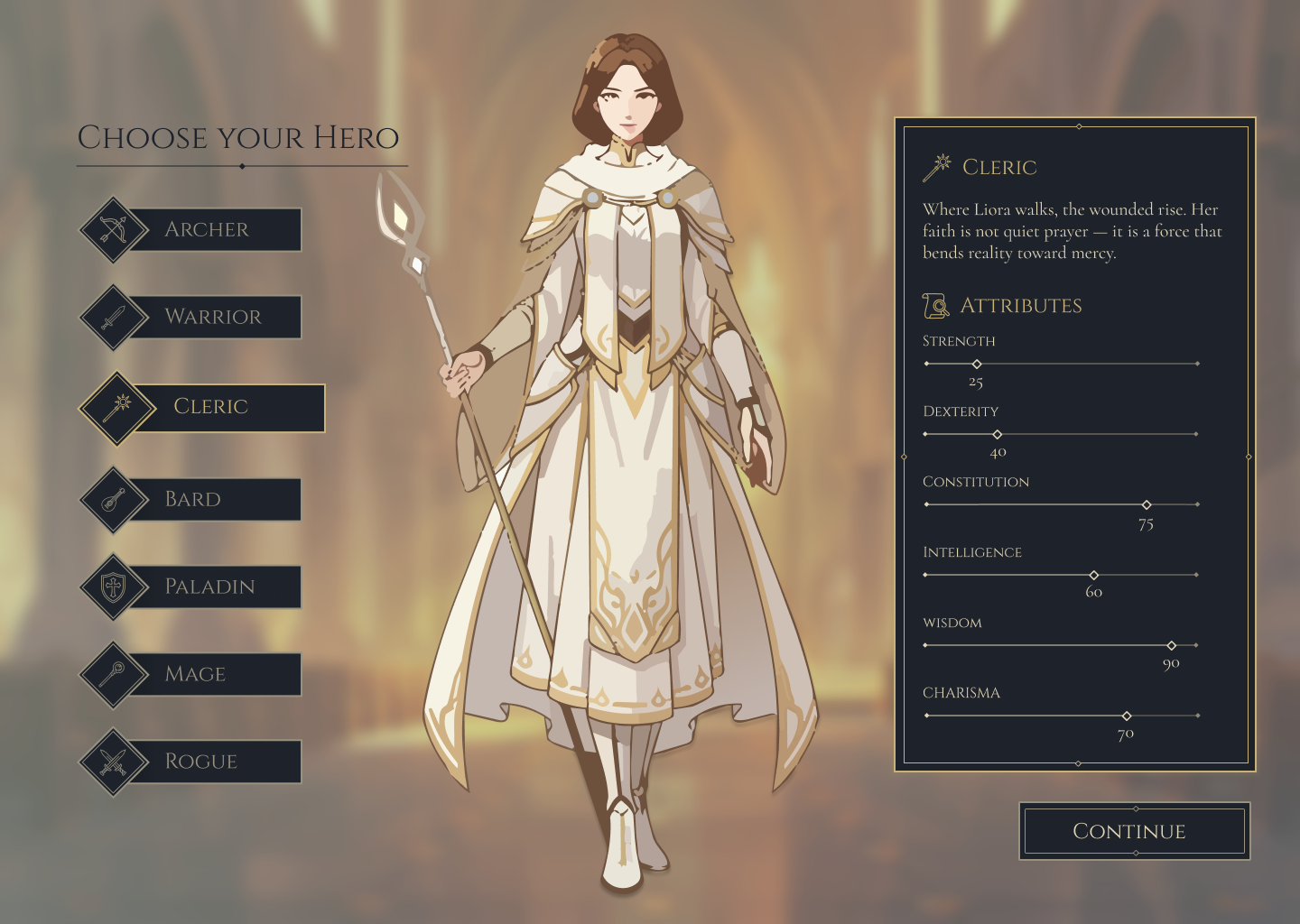
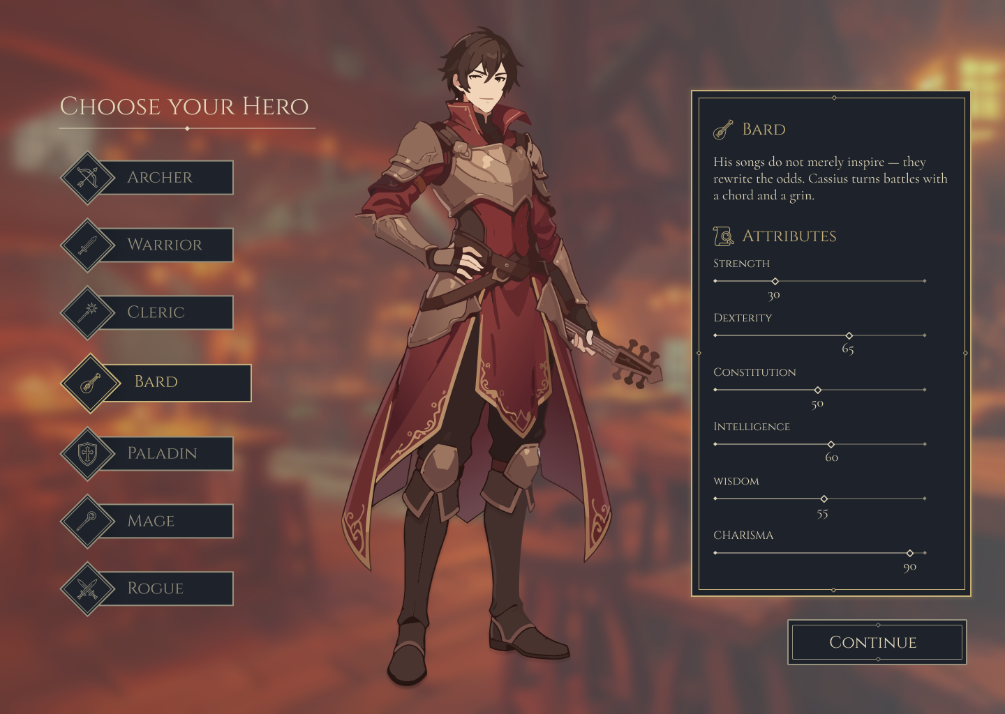
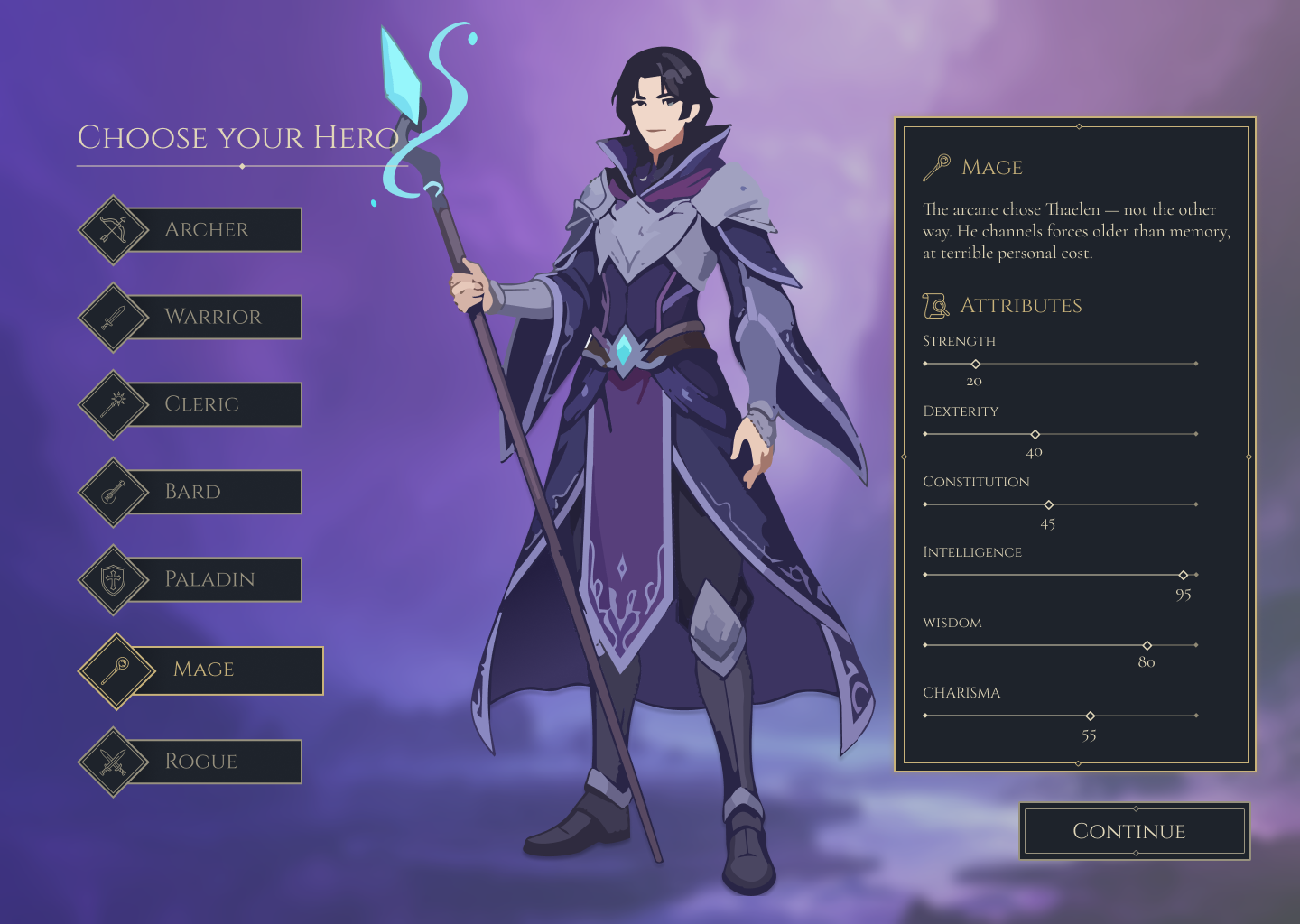
Each class was designed with a dominant attribute to ensure clear gameplay identity and visual distinction in the stat panel. The roster combines recognisable RPG archetypes with clear tonal differences, helping each selection feel immediate and legible.
The flow was designed as a guided onboarding experience, moving from mood-setting entry points into more informed gameplay choices. Each screen introduces information gradually, using composition, lighting, and interface hierarchy to guide attention.
Main Menu
The entry screen establishes tone immediately through atmospheric lighting, restrained ornament, and a clear primary action path. The composition was designed to feel cinematic without sacrificing legibility.
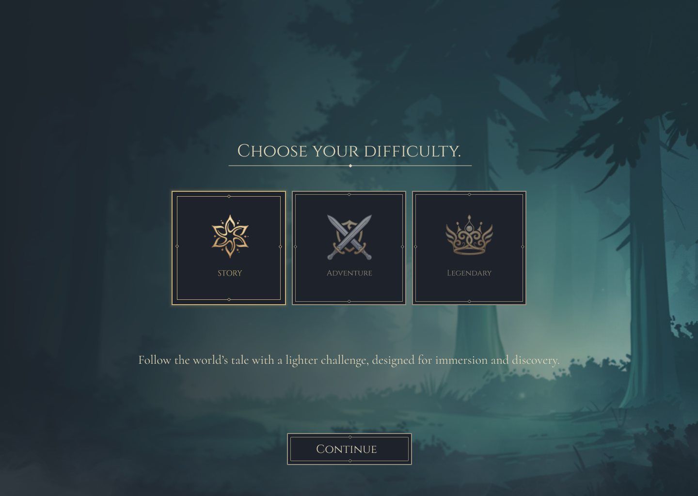
Difficulty Selection
The difficulty screen introduces progression through focused choices, using hierarchy and spacing to keep the decision readable while maintaining the project’s dramatic tone.
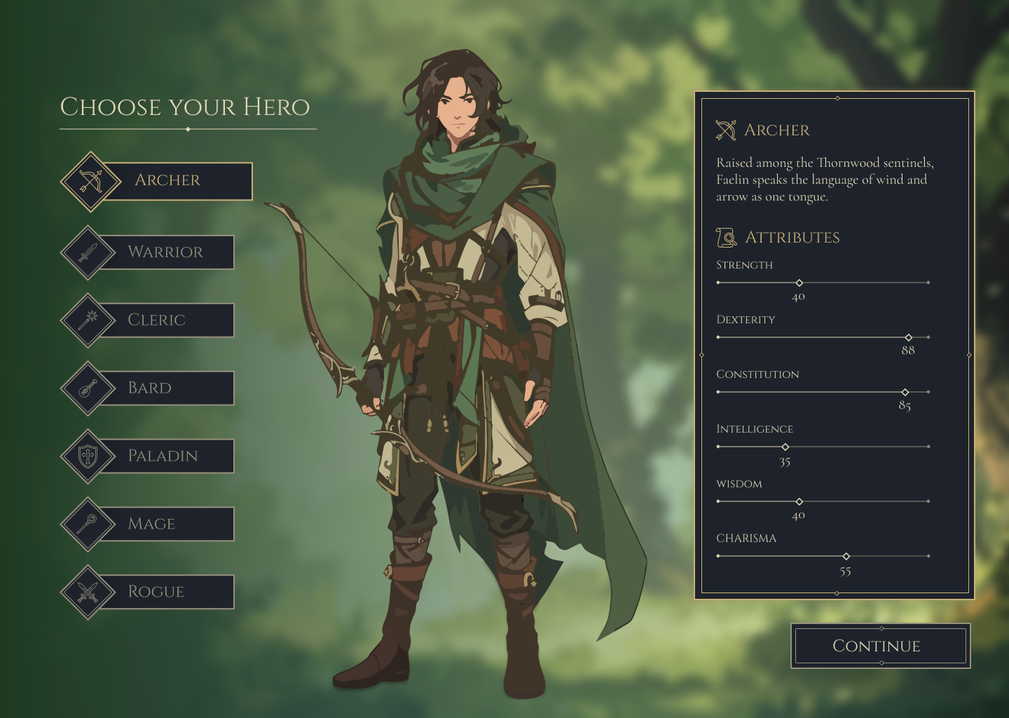
Character Selection
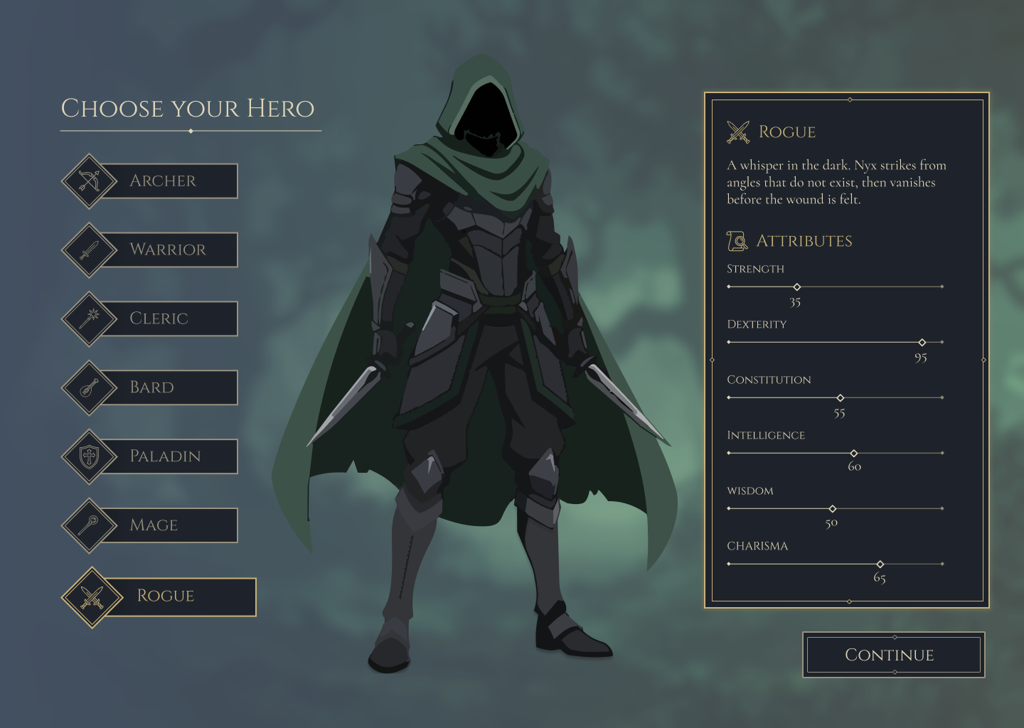
Class selection was treated as both a gameplay choice and a storytelling moment. Character art, background, iconography, and stat emphasis work together to define identity at a glance.
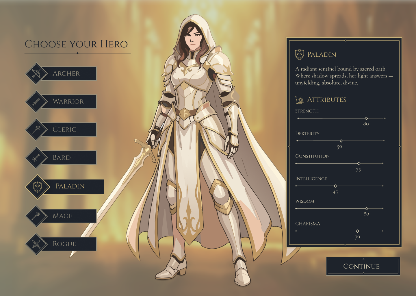
Supporting States
Beyond the primary flow, supporting panels were designed to hold alternate class states, attribute shifts, and thematic variations while keeping the interface coherent and recognisably part of the same system.
Each class uses a dedicated character illustration, icon, thematic background, and stat profile to reinforce identity and support player decision-making. Together, they create a roster with clear class identity while still feeling part of a single world.
A restrained fantasy language built around atmosphere and hierarchy.
The interface uses deep desaturated tones as its base, creating a grounded backdrop for content, lighting, and character art. Soft gold accents are used selectively to guide focus and establish hierarchy, creating a premium, atmospheric feeling through the contrast between dark surfaces and luminous details. The palette was designed to balance immersion and usability, keeping the UI expressive without becoming visually noisy.
Within that shared system, each class carries its own supporting colour identity to create immediate distinction without breaking cohesion: Archer uses green, Warrior leans into a steel blue-grey, Cleric is framed through warm ivory, Bard uses a deep red, Paladin is anchored in gold-white, Mage introduces violet, and Rogue is supported by a dark muted green. These shifts help each path feel recognisable at a glance while remaining clearly part of the same interface world.
Archer
#5d7b52
Warrior
#6b7888
Cleric
#e5dcc4
Bard
#7a3b40
Paladin
#d7c08a
Mage
#7d6ea8
Rogue
#495a4b
Colour, Layout, and Atmosphere
Aetheria’s visual language is built around quiet contrast: dark desaturated surfaces, softly lit environments, and gold details that help priority actions and information rise forward without breaking the mood.
UI Components
Buttons, menus, dividers, and stat groupings were designed as a reusable system rather than isolated screens, allowing the interface to scale with consistency.
Class Variations
Class-specific backgrounds, iconography, and stat emphasis shift the mood of each selection while preserving a cohesive visual foundation across the system.
Although presented here as a static case study, the project was designed with motion logic in mind from the outset. Hover states, class switching, stat transitions, and atmospheric background changes were planned as part of the interaction system rather than added later. Rive animations and interactive prototypes are currently in development as the next iteration of the project, extending the same visual language into a more responsive player experience.
A UI study that became a small world-building system.
The final outcome is a cohesive interface study built around clear class identity, a consistent visual system, and an immersive onboarding flow that guides players from first impression to informed selection. More than a single menu, Aetheria became a player-facing experience with stronger narrative atmosphere, more intentional hierarchy, and a clearer relationship between branding, interface design, and motion direction.